Table of Content
How do you make sure people actually look at your screens instead of walking right past them? To create outstanding digital signage content, focus on visual economy: keep it simple, readable, and useful. The best slides deliver their message in a three-second glance, use high-quality graphics that fit your screen, and have a clear purpose. When you balance smart design with basic accessibility rules, your screens become helpful tools that grab attention without tiring the viewer.
Great content is about more than just good design; it is about performance in the real world. Success depends on lighting, screen location, and the viewer's current needs. When these factors align, your digital signage becomes a reliable guide rather than a distraction.

Key Factors That Shape Outstanding Digital Signage Content
What Are the Main Goals of Digital Signage Content?
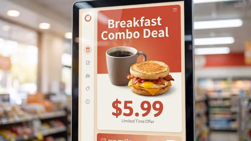
Every slide needs a reason to exist. Usually, your goal is to inform, persuade, or direct. In a retail store, you might want to highlight a flash sale to boost revenue. In an office or school, the goal might be sharing safety alerts or building culture with team photos.
Defining these goals prevents you from filling playlists with "content just to have content," which creates clutter. When your messages support real business targets, it is easier to prove ROI. Whether you want to reduce wait-time frustration in a clinic or drive brand awareness in a hotel, your goals should decide the look and speed of every asset.
Who Is the Target Audience for Digital Signage?
Knowing your audience is the first step. Commuters rushing through a station need fast facts, while guests in a hotel lounge have time for a story. Think about who is watching and how much time they have.
Your audience also determines your style. A university screen might use bright colors and social trends, while a corporate lobby screen usually benefits from clean, professional visuals. Matching your visual style to the viewer ensures your message connects quickly.
How Does Location Influence Content Success?
Where you put the screen changes how you should design for it. Lighting is a major factor. If your screen faces a sunny window, you need high brightness (1000-2500 cd/m²) so the image does not look washed out. In a dimmer hallway, standard brightness is better to avoid hurting eyes.
Distance matters, too. If people view the screen from 7-10 feet away, you need large text and bold images. If the screen is mounted high up, keep important info away from the very edges. Always check if your hardware supports HD (1920x1080) or 4K (3840x2160) so your content stays sharp.

What Is Dwell Time and Why Does It Matter?
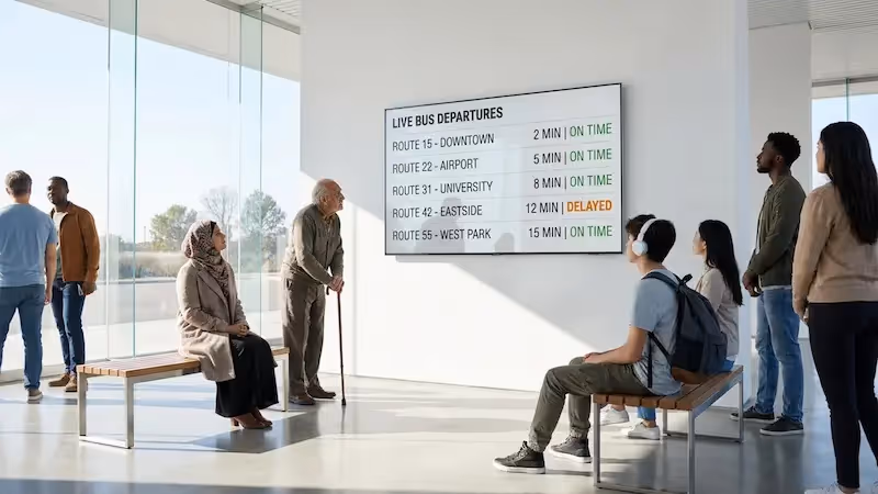
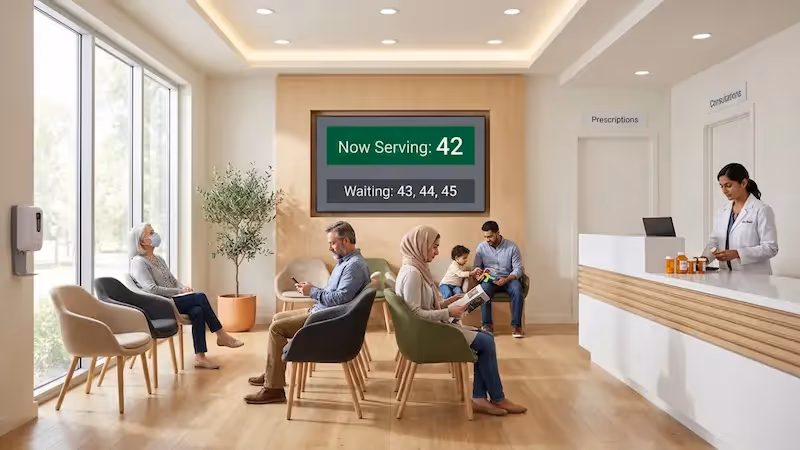
Dwell time-how long a person stays near the screen-tells you how long your content should be. In busy spots like malls, you might have only 8 to 15 seconds. Here, content must be instant: one image, one headline. If they cannot read it while walking, it is too long.
In "long-stop" zones like waiting rooms or cafes, you have more time. You can run loops from 45 seconds to two minutes with weather, news, or trivia. Matching your playlist length to dwell time prevents frustration from slides that flip too fast or boredom from slides that never change.
Core Design Principles for Effective Digital Signage
Clarity and Simplicity of Messages
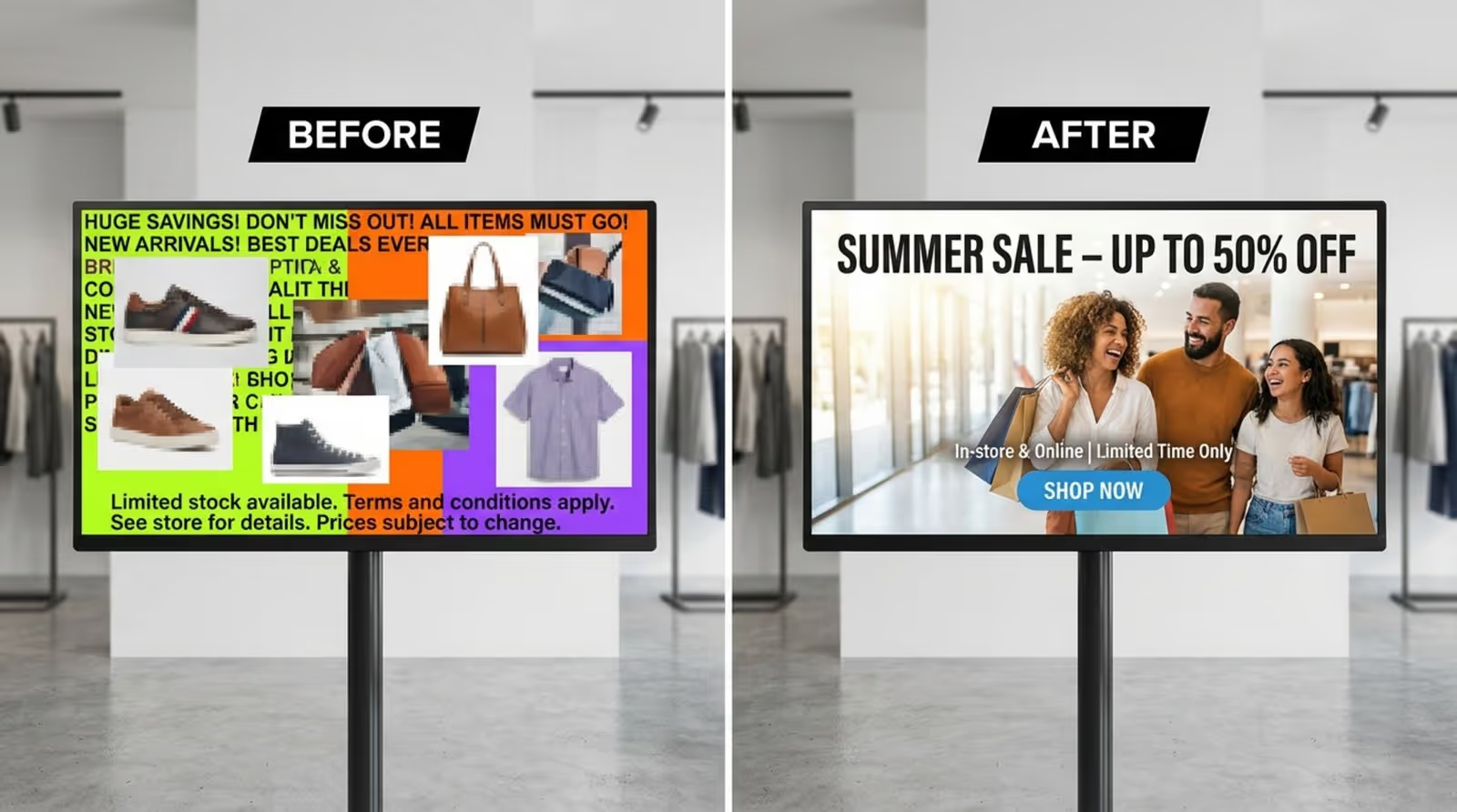
On digital signs, less is more. Because viewers are often moving, strip your message down to the main point. Do not treat a sign like a website or flyer. It is a quick visual headline.
A helpful guide is the "3x5 rule": use three lines of text with five words each, or five lines with three words each. This keeps word counts low and impact high. If you need a paragraph to explain it, break it into multiple slides or use a QR code for the details.
Visual Hierarchy and Layout
Good layout guides the eye. Your headline should be the biggest element, followed by a sub-headline or call to action. Avoid clutter; one strong photo is often better than four small ones.
Leave plenty of "white space" (empty space) around your text and images. Filling the screen to the edges makes content look cramped and hard to read. Margins make your slides look professional and easier to scan.
Font and Text Readability
Font choice affects speed of reading. Sans-serif fonts like Arial, Roboto, or Open Sans are ideal because they remain clear from a distance. Fancy scripts or handwriting styles often look messy on digital displays.
Stick to one or two fonts per slide. Use bold for headlines and regular weight for details. Using the same font style across all your playlists helps build a consistent brand look.
Choosing Appropriate Font Size and Style
Text must be large enough to read from feet away. For headlines, try 72 to 144 points. Body text should be at least 36 to 54 points. Anything smaller than 20 points usually gets lost.
Avoid using italics for long sentences, as they can be hard to read on a glowing screen. Use bold text or a different color to highlight key words instead. This keeps the message sharp.
Best Practices for Text Placement
Put text where people look naturally-usually the center or top third of the screen. If you put text over a photo, use a dark overlay or shadow behind the letters so they stand out.
Watch out for the "safe zone." Some TV screens cut off the outer edges of the picture. Keep logos and text about 5%-10% away from the edge to ensure nothing gets chopped off.
Color Contrast and Accessibility
Contrast is essential for readability. You need a strong difference between your text and background. White text on dark blue, or black text on white, works best. Avoid low-contrast pairs like yellow on white, which are almost impossible to read.
Use color to signal meaning. Save bright red for alerts or safety warnings so they stand out. For standard content, use your brand colors or high-contrast combinations that are easy on the eyes.
Color Choices for Visibility
Consider the room lighting. Neon colors might look cool on a laptop but can be painful on a large, bright wall screen. Choose rich, solid colors. You can use free online contrast checkers to make sure your text is visible to everyone.
Compliance with Accessibility Standards
Accessible design helps everyone. Following basic guidelines helps people with visual impairments read your signs. Keep contrast ratios high (at least 3:1 for large text). If you use interactive kiosks, ensure buttons are within reach (36-42 inches from the floor) for wheelchair users.
Media Optimization: Images, Video, and Motion Graphics
Choosing the Right Types of Content for Digital Displays
Mix your media to keep interest high. Use simple slides for promos, but add dynamic content like weather or news feeds to keep the screen useful. In large buildings, directories and maps are highly valued by visitors.
Avoid generic stock photos that look fake. Authentic photos of your actual team, products, or location build more trust. Real imagery makes the screen feel connected to the environment.
Image and Asset Sizing for Screen Resolutions
Blurry images make your business look unprofessional. Always match your image size to the screen resolution. Most screens are 1920x1080 (Landscape) or 1080x1920 (Portrait). If you have 4K screens, use 3840x2160 visuals.
Use JPG files for photos to keep file sizes manageable, and PNG files when you need a transparent background. Stick to standard resolutions (around 72-96 dpi) to ensure smooth playback on all players.
Video and Animation: Timing, Transitions, and Loops
Motion draws the eye, but too much is distracting. Keep animations short (under 30 seconds). If you show a video, use captions so people can understand it even if the sound is off.
Transitions should be simple. A clean fade is better than a flashy, spinning effect. Smooth transitions keep the viewer focused on the message, not the special effects.
Avoiding Cognitive Overload and Visual Blindness
"Cognitive overload" is just a fancy way of saying the viewer's brain is overwhelmed. If a slide has too much info, people stop reading. Stick to one idea per slide. If you have five points, use five slides.
"Banner blindness" happens when a screen never changes. If the content is static for weeks, people ignore it. Rotate your layouts and refresh your visuals regularly to keep eyes on the screen.

Branding, Legal, and Accuracy Considerations
Ensuring Consistent Branding and Logo Placement
Your screens are part of your brand. Use your official colors, fonts, and logos. This builds trust and makes your location feel professional. Keep your logo in the same spot (like the bottom corner) on every slide so viewers always know who is speaking.
Image and Copyright Compliance
Never just download images from a search engine. It looks unprofessional and can cause legal issues. Use your own photos, stock images you have licensed, or free assets from approved libraries. Platforms like Look Digital Signage often provide built-in tools to help you create legal, on-brand content easily.
Reviewing Content Accuracy and Timeliness
Typos and wrong dates hurt your credibility. Promoting a lunch special that ended yesterday makes the screen look neglected. Always spell-check your text and preview your slides before publishing.
Managing and Refreshing Digital Signage Content Over Time
Content Scheduling and Rotation Strategies
Keeping screens fresh takes work, but the right software makes it simple. We recommend using Look Digital Signage for this. With the Look CMS, you can manage content from anywhere and use Smart Scheduling to automate changes. You can set breakfast menus to switch to lunch offers automatically, or schedule weekend promos to start on Friday afternoon.
Look DS also offers ready-made digital signage templates, which help you create professional layouts in minutes without needing a designer. This keeps your playlists active and engaging without wasting staff hours.
Monitoring for Relevance and Audience Engagement
Signage is not a "set and forget" tool; it needs to stay relevant. Using Playback Analytics in Look CMS allows you to see exactly what played and when. This data helps you optimize your loops. If you want to know if a promotion is working, use a unique QR code on the screen and track the scans. This simple feedback loop helps you understand what your audience wants.
Quick Guidelines to Elevate Your Digital Signage Content
Checklist for Designing Impactful Digital Signs
- Simplicity: Can you read the slide in three seconds?
- Legibility: Are you using large, clear fonts with high contrast?
- Quality: Are images sharp and sized correctly (e.g., 1920x1080)?
- Call to Action: Is the next step clear (e.g., "Scan code" or "Ask at desk")?
- Accuracy: Are dates, prices, and spelling correct?
Common Mistakes to Prevent in Content Creation
A frequent mistake is stretching small images to fit a big screen, which makes them pixelated. Another error is using long URLs that no one can type. Use a QR code instead. Also, avoid filling every inch of the screen; empty space helps the important parts stand out.
Looking ahead, the best digital signage will rely on data and automation. Instead of just guessing what works, you can use analytics to prove ROI and tools like Look Digital Signage to keep screens running smoothly with offline playback capabilities. By focusing on clear, timely, and data-backed content, you turn your screens into a powerful asset for your business.