Table of Content
How can you create digital signage content that viewers actually notice and remember? The answer lies in simplicity: combine high-contrast visuals with a single, focused message that the brain can process in under a second. While technical details like 16:9 aspect ratios and 4K resolution matter, the real key is designing for clarity, context, and immediate readability.
In busy public spaces, "visual noise" makes it hard to grab attention. Effective design breaks through this clutter without overwhelming the viewer. Whether you manage one screen in a café or a global network of airport displays, the goal is the same: deliver information that is easy to see, easy to understand, and drives the next step.
What Defines Effective Digital Signage Design?
How Digital Signage Impacts Communication and Engagement
Digital signage works because it uses motion and light to catch the eye in ways static posters cannot. Humans are wired to notice movement, making screens a powerful tool for sharing messages that evolve throughout the day. When executed well, these displays bridge the gap between your brand and your audience, creating memorable moments that influence decisions.
Engagement isn't just about looking-it is about understanding. If a viewer cannot grasp your message instantly, they will likely ignore it. Good design respects how people process information. By using clear images and simple motion, you can spark curiosity or urgency, making your marketing messages easier to recall and act upon.
Common Misconceptions in Digital Signage Design
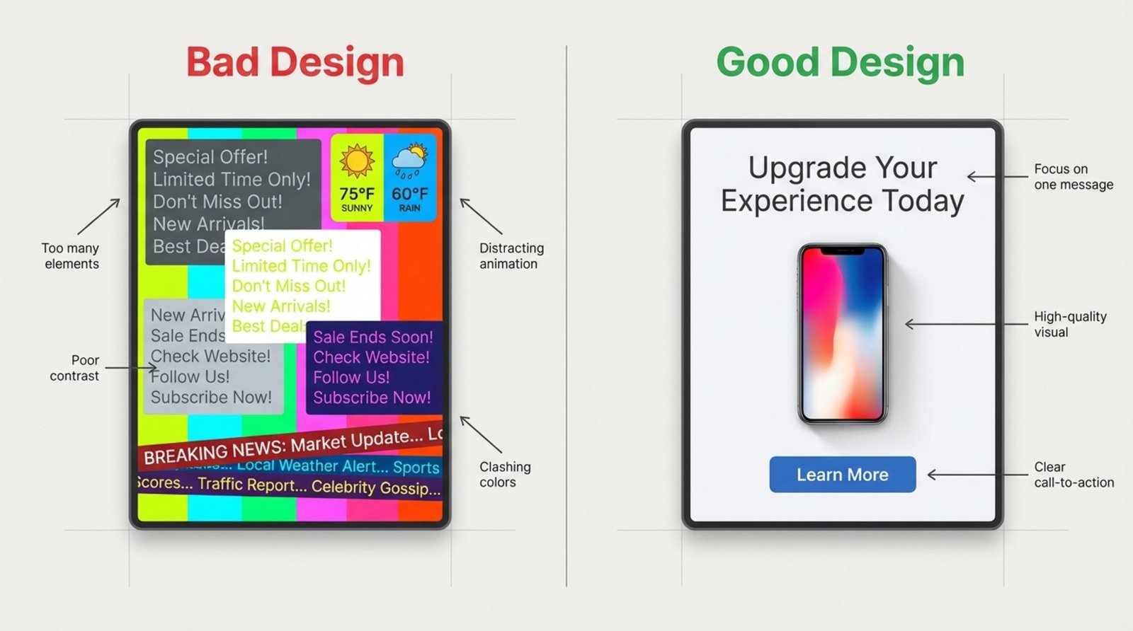
A common mistake is thinking "more is better." Many teams feel pressured to fill every inch of a screen with tickers, widgets, and paragraphs of text. However, overcrowded screens confuse viewers and dilute your main point. Simplicity wins. One focused message is almost always more effective than a busy layout fighting for attention.
Another myth is that any digital image will work. In reality, design depends heavily on the physical environment. A layout that looks perfect on a laptop may look washed out in a sunny window or pixelated on a large wall. Professional design requires thinking beyond the software and considering the real-world conditions where the screen lives.
How to Align Digital Signage Design with Business Goals
Clarifying Target Audience and Key Objectives
Before opening your design tools, ask: Who is seeing this, and what should they do? A diner seated in a restaurant has time to read, while a passerby on the street has only seconds. Defining your audience helps you shape content that drives results, rather than just filling space.
Set specific goals. Do you want to increase sales of a specific item, reduce perceived wait times, or improve internal communication? Pick your top objectives and design a visual hierarchy that guides the eye to the most important information first.
Choosing the Right Content Types for Your Message
Variety keeps screens interesting. Mixing static images with subtle animations and live data helps avoid the "wallpaper effect," where frequent visitors stop noticing the screens. In retail, sharp product photography is essential. In corporate offices, highlighting team wins or KPI dashboards may be more relevant.
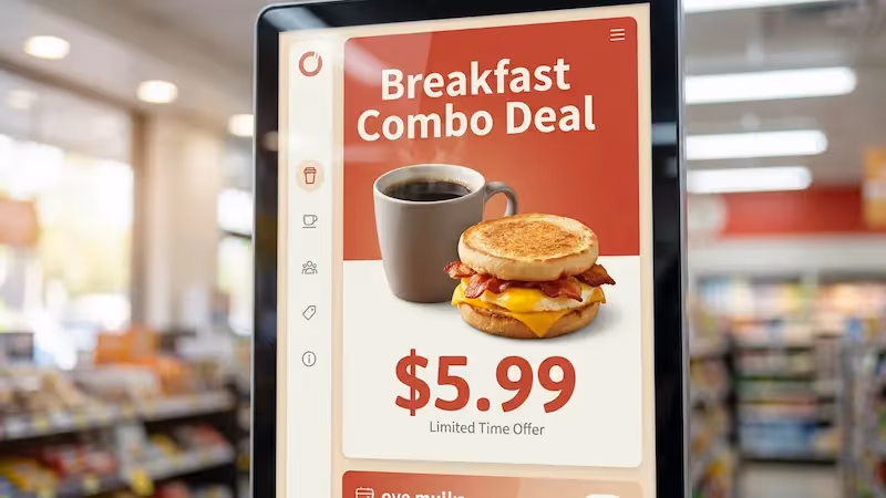
Avoid generic branding that lacks a clear next step. If you use brand loops, keep them short-quick buffers between value-driven content. For menus, color psychology matters: reds and oranges can stimulate appetite, while blues in healthcare or finance settings suggest stability and trust.
What Technical Factors Influence Digital Signage Design?
Display Aspect Ratios: Recommended Standards
Your content must match your screen's shape. Most standard displays use a 16:9 aspect ratio for landscape (horizontal) orientation and 9:16 for portrait (vertical). Designing in the wrong ratio leads to stretched or squashed images, which looks unprofessional.
While 16:9 is the standard, some setups vary. Tablets often use 4:3, and LED walls can have custom dimensions. Always confirm the hardware specs-whether it is a standard TV, a portrait kiosk, or a video wall-before finalizing your artwork to ensure a perfect fit.
Resolution and Pixel Density: Why It Matters
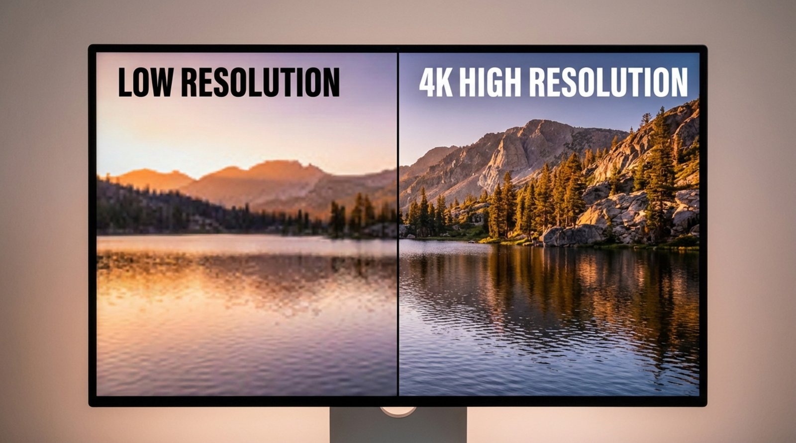
Resolution determines how sharp your content looks. As a baseline, design at 1920 x 1080 pixels (Full HD). For larger displays or screens where viewers stand close, 3840 x 2160 (4K) is ideal to keep text and images crisp.
Low-resolution files can ruin an otherwise good design. Stretching a small photo to fit a large screen results in blurriness that hurts your credibility. Always start with high-quality assets and let the software scale them down if necessary, rather than trying to upscale small images.
Environmental Lighting and Viewing Distance Considerations
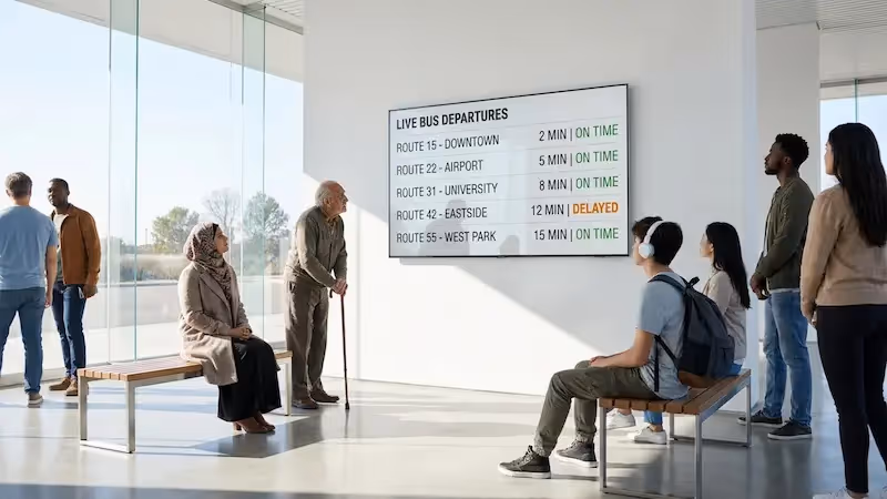
The screen's surroundings define its success. In bright areas or storefronts, you need high-brightness screens (1000+ nits) and high-contrast designs to prevent the image from looking washed out. Dark text on light backgrounds-or vice versa-ensures readability even in sunlight.
Distance dictates font size. A message read from 10 feet away requires much larger text than a touchscreen used at arm's length. A helpful rule of thumb is to make text at least one inch tall for every 10 feet of viewing distance.
How Environment and Placement Shape Digital Signage Success
Choosing Locations for Maximum Visibility
Placement is just as critical as design. High-traffic areas like entrances, waiting rooms, and checkout lines offer the best visibility. However, you must consider the viewing angle. Screens should be mounted at eye level or angled slightly downward so they are easy to see without strain.
Watch out for obstructions like pillars, hanging lights, or signage that might block the view. The best location aligns with the natural flow of traffic, placing your message directly in the viewer's line of sight right when they are ready to engage.
Design Adapting to Dwell Times and Foot Traffic
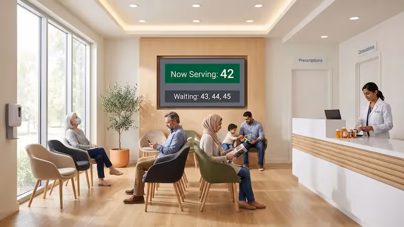
Match your content length to the viewer's schedule. In a transit hub or mall where people walk past in seconds, content must be bold and instant-think "headline plus image." In waiting rooms where dwell time is longer (5-20 minutes), you can run longer playlists, detailed announcements, or entertainment loops.
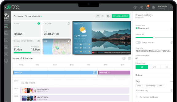
Look Digital Signage helps you manage this balance easily. With Smart Scheduling, you can program quick-hit promos for rush hours and longer, informative content for slower periods, ensuring your screens always match the pace of the room.
Accessibility Considerations for Diverse Audiences
Accessible design ensures everyone gets your message. Use high contrast to aid viewers with low vision and keep language simple. Tools like color contrast checkers can help verify that your text stands out clearly against the background.
For interactive kiosks, placement matters. Interactive elements should be reachable for wheelchair users, typically between 36 and 42 inches from the floor. If your signage includes wayfinding, ensure the routes and maps are clear for all ability levels.
Visual Design Principles for Effective Digital Signage
Best Layouts for Information Flow
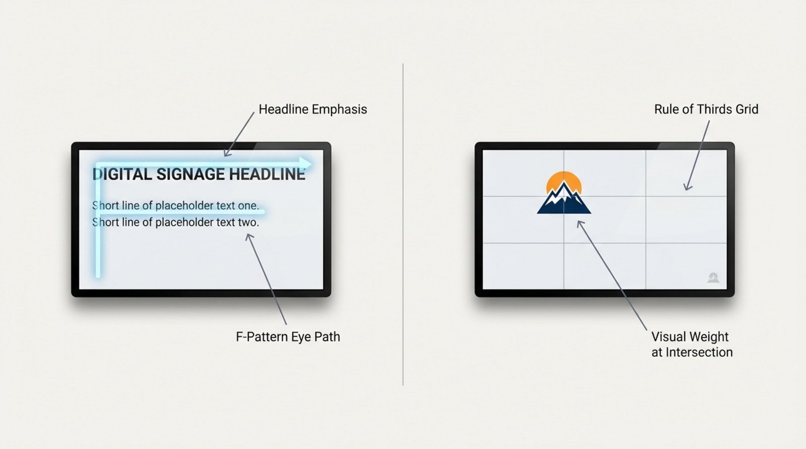
Structure your layout to guide the eye. The "F-Pattern" (reading left-to-right, top-to-bottom) is natural for text-heavy slides. The Rule of Thirds-placing key elements at the intersection points of a 3x3 grid-creates a balanced, professional look.
If you need to display multiple data points, use Screen Layouts within your CMS. This allows you to split the screen into zones (e.g., a main video zone, a sidebar for announcements, and a ticker at the bottom). Just remember to keep the most important message in the largest zone and leave "breathing room" around the edges.
Font Selection and Readable Text Sizes
On digital screens, sans-serif fonts like Arial, Roboto, or Helvetica are the easiest to read quickly. They remain clear even from a distance. Avoid italics or overly decorative scripts, which can become illegible on lighted displays.
Size matters. For a standard viewing distance, keep body text above 20-30 points and headlines significantly larger. Stick to one or two font families to maintain a clean, cohesive appearance. Consistency makes your content look authoritative rather than cluttered.
Color and Contrast for Visibility
Contrast is the single biggest factor in legibility. White text on a dark blue background or black text on yellow are classic examples of high-contrast pairings that work well. Avoid low-contrast combinations like gray text on a white background, which can disappear under bright lights.
Color also sets the mood. Red creates urgency for sales or alerts; blue conveys professionalism and trust; yellow grabs attention and feels energetic. Choose colors that align with your brand but prioritize visibility above all else.
Use of Images, Icons, and High-Quality Visuals
High-quality visuals build trust. Avoid generic, low-quality stock photos that look fake. Instead, use authentic images of your products, team, or location. If you lack design resources, the Look AI Wizard inside Look CMS can help you generate unique, high-quality images and layouts in seconds.
Icons are powerful shortcuts. A simple "coffee cup" icon communicates "café" faster than reading the word. When using third-party logos (like social media icons), always follow their brand guidelines regarding space and color to keep your display looking professional.
Incorporating Motion and Animation Strategically
Motion grabs attention, but it must be used wisely. Subtle animations-like a slow fade or a gentle slide transition-add polish. Aggressive flashing or fast-spinning text can be annoying and push viewers to look away.
Keep the core message static long enough to be read, and use motion for transitions or to highlight a specific element. Smooth, modern animations signal quality, while jerky or dated effects can cheapen the perception of your brand.
Best Practices for Clear Messaging and Calls-to-Action
Keeping Content Clear and Concise
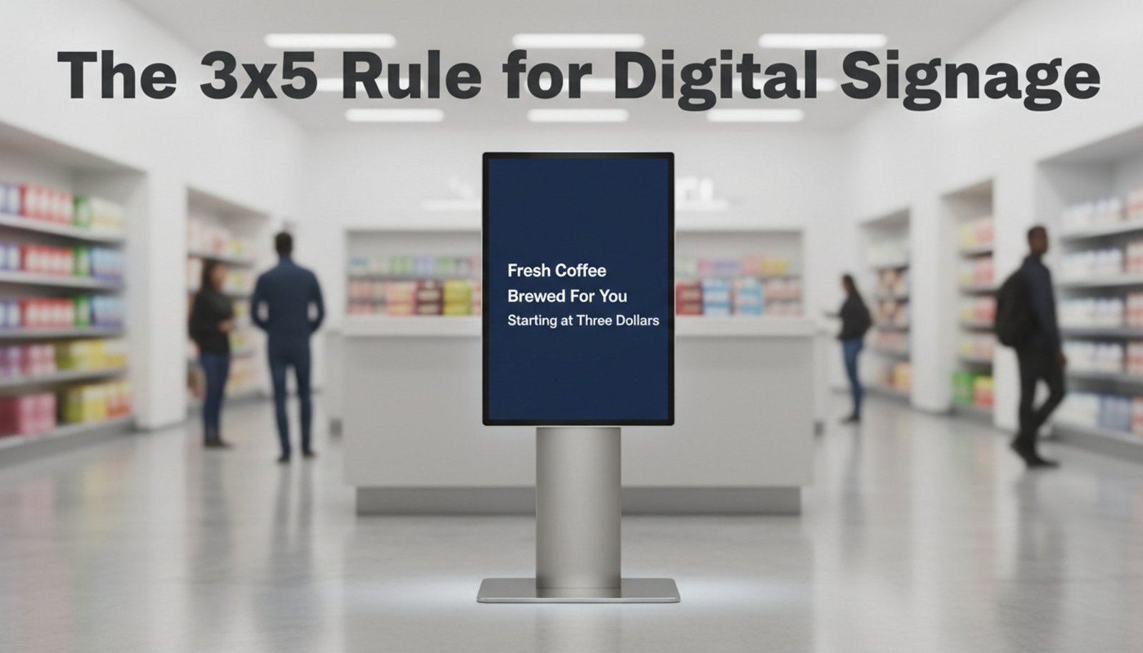
Digital signage is a "glance medium." You have limited time to make an impact. A good guideline is the 3x5 rule: keep text to three lines of five words, or five lines of three words. This ensures the message can be absorbed instantly.
Focus on one main idea per slide. If you have complex information, break it down into a series of simple slides rather than cramming it all onto one. Use active verbs and plain language to make your point quickly.
Placement and Emphasis of Calls-to-Action (CTAs)
Every commercial screen needs a clear Call-to-Action (CTA). Whether it is "Scan to Order," "Follow Us," or "Ask a Associate," the next step must be obvious. visual emphasis-like a contrasting button color or larger font-helps the CTA stand out.
Placement is key. Putting the CTA at the end of a visual flow works well, but for short interactions, keep it visible the entire time. If using QR codes, ensure they are large enough to scan from a comfortable distance.
Consistency with Branding and Legal Requirements
Maintaining Brand Identity Across Displays
Your screens should feel like an extension of your brand. Use your official colors, fonts, and logos to ensure immediate recognition. Look Digital Signage makes this simple with Ready-made Templates that you can customize to match your brand guidelines, ensuring consistency across one screen or a thousand.
Consistency builds trust. When a customer sees a familiar look and feel, they are more likely to trust the message. Using a centralized CMS allows you to lock in these brand standards so that local managers can update text without "breaking" the design.
Legal and Copyright Compliance for Content
Never use copyrighted images, music, or video without permission. Taking images from Google Images can lead to legal issues. Stick to licensed stock libraries, your own original photography, or content from the Look Content Creator which is safe to use.
Additionally, when displaying partner logos or social media icons, adhere to their specific usage rules. This attention to detail protects your business and maintains a professional relationship with other brands.
How to Keep Your Digital Signage Content Fresh and Relevant
Content Update Frequency and Scheduling
Stale content teaches people to ignore your screens. Aim to refresh your playlists regularly. Even small changes, like updating a background image or tweaking a headline, can re-engage viewers. Look DS allows you to manage this effortlessly from anywhere, letting you publish changes in minutes.
Use scheduling to your advantage. You can set specific content to play during breakfast, lunch, or happy hour, or schedule seasonal campaigns weeks in advance. This automation keeps screens relevant without requiring daily manual work.
Leveraging Real-Time Data and Social Media Feeds
Dynamic content keeps screens alive. Integrating live feeds for weather, news, or traffic gives people a reason to look at the screen repeatedly. When they check the weather, they also see your promotional content.
Look Apps allow you to easily add these dynamic elements-like Instagram feeds or RSS news tickers-directly into your layouts. This keeps your displays fresh automatically, reducing the pressure to constantly create new static designs.
Measuring Digital Signage Performance and Improving Your Design
Using Analytics to Evaluate Effectiveness
To improve your strategy, you need data. Look Digital Signage provides Playback Analytics that show exactly what played, how often, and on which screens. This proof-of-play data helps you verify that your campaigns are running as planned.
Combine this technical data with business metrics. If a specific product promotion is running on screens, track the sales lift for that item. Regular reviews help you identify which designs drive results and which ones need to be retired.
A/B Testing and Iterative Design Practices
Don't guess-test. A/B testing involves running two different versions of a message (e.g., different headlines or images) to see which performs better. You might find that a red background drives more action than a blue one, or that a specific photo resonates more with your audience.
Gather feedback from staff and visitors. A design that looks great on a designer's monitor might have glare issues in the lobby. By testing in the real environment and using Look DS to make quick adjustments, you can continuously refine your content for maximum impact.
Want to learn more? Watch the Look Academy video Free course on digital signage design