Table of Content
How do you turn complex data into a clear story that drives decisions? Power BI dashboards improve your reports by transforming raw numbers into a single “control center” that displays key performance indicators (KPIs) at a glance. By using the right templates for sales, finance, or operations, you can connect data to real business actions, allowing teams to spot trends and resolve issues in real time.
In a data-heavy environment, clarity is a major competitive advantage. Power BI is a strong tool for this, offering smooth connections to Excel and cloud services without requiring advanced coding. However, a dashboard is only effective if your team actually sees it. Whether you are viewing these metrics on a laptop or using Look Digital Signage to display them on office screens via the Look App, the right dashboard example gives you a solid foundation to move from static spreadsheets to dynamic visual insights.
What Is a Power BI Dashboard and How Does It Differ from a Report?
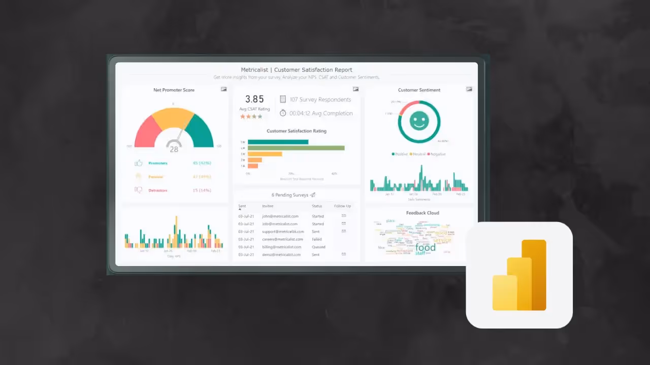
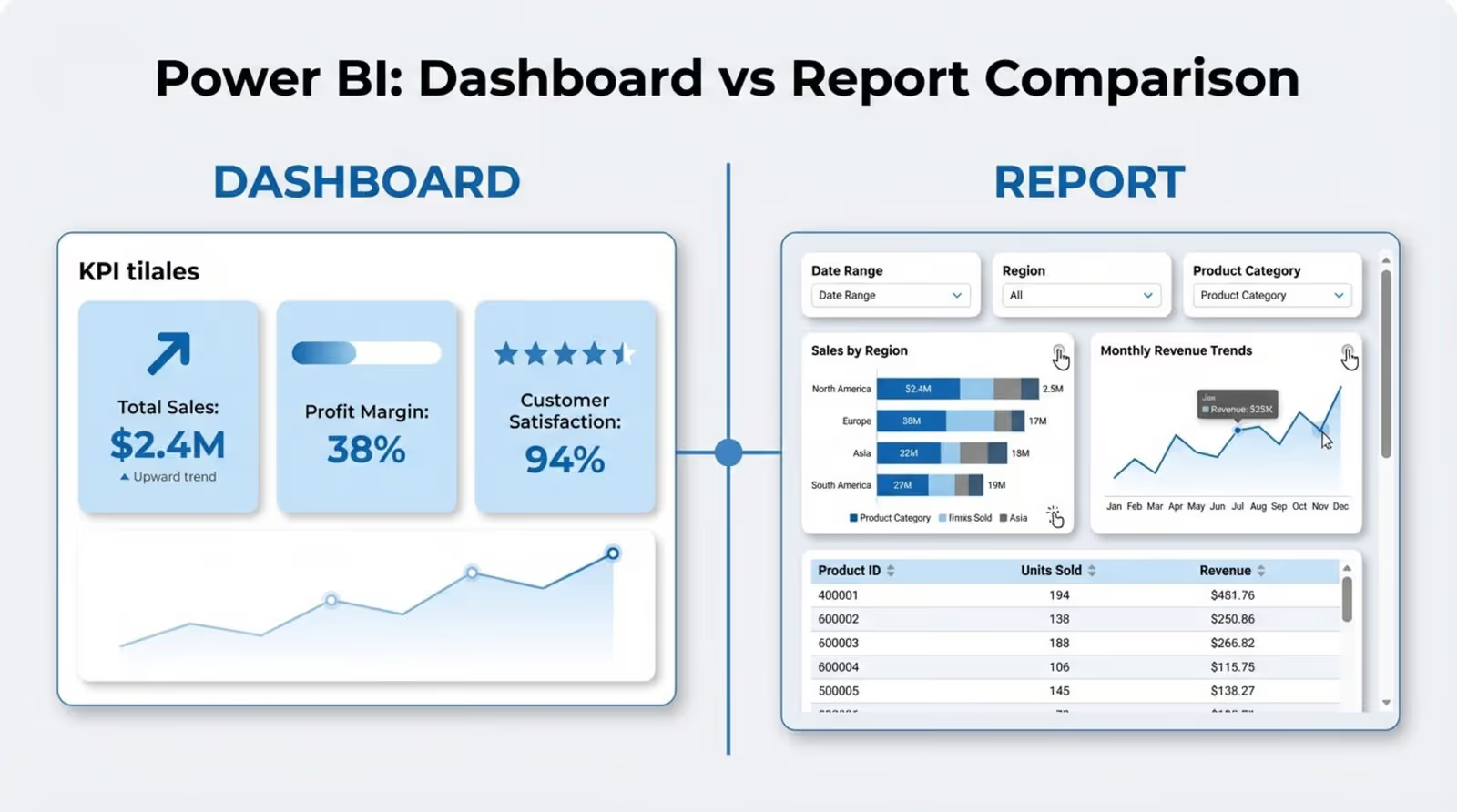
People often use “dashboard” and “report” interchangeably, but in Power BI, they serve different purposes. A dashboard is a single-page, high-level view designed to show the overall health of the business in seconds. Think of it as a canvas where you “pin” the most critical visuals-called tiles-from various reports. This allows an executive or manager to see key sales, HR, and finance metrics in one place, updated in near real-time.
A report, on the other hand, is built for deep analysis. Reports often contain multiple pages and provide the granular data needed to answer “why” something happened. While a dashboard might alert you that sales are down, the connected report allows you to filter by region, salesperson, or product category to find the root cause. Reports offer rich interaction, while dashboards focus on simplicity and immediate awareness.
Key features distinguishing dashboards from reports
The technical differences are important for keeping your data strategy organized. Dashboards live exclusively in the Power BI Service; you cannot create them in the Desktop app. They are designed for quick consumption, meaning they usually offer less interactivity than reports to keep the view simple. Clicking a dashboard tile typically links you directly to the detailed report where the data originated.
Dashboards are also unique because they can aggregate data from multiple datasets. While a report usually connects to a single source, a dashboard can display a marketing metric next to a manufacturing KPI. This cross-department capability makes dashboards ideal for “business control centers” or lobby displays running on Look Digital Signage software, where you need a holistic view of operations.
When to use dashboards versus reports in Power BI
Choose a dashboard when your audience needs a high-level monitor-think C-level leaders, department heads, or a general staff screen in a breakroom. If the goal is to track company OKRs or monitor live operations (like server uptime or call volume), a dashboard is the best fit because it summarizes complexity into a clear status update.
Use reports when your audience includes analysts or managers who need to manipulate the data. If they need to filter historical timelines, run variance analysis, or dig into specific transaction rows, a multi-page report is necessary. In short: use dashboards to show “what” is happening right now, and reports to explore “how” and “why” it is happening.
Why Use Power BI Dashboards to Improve Reports?
Adding dashboards to your reporting process is one of the most effective ways to increase data adoption. Data teams often generate dense reports that stakeholders find overwhelming. Dashboards act as a “hook”-they present the most valuable insights first, encouraging users to dig deeper only when necessary. This layered approach respects your team’s time while maintaining access to the details.
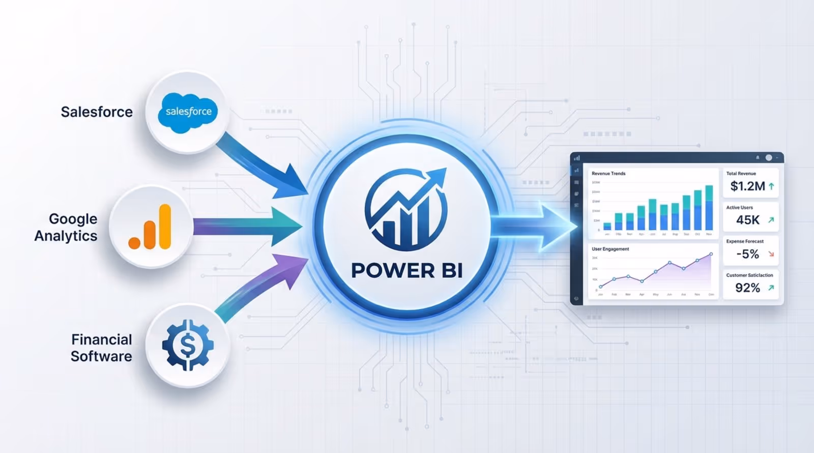
Dashboards also help break down data silos. By pulling metrics from different tools-such as Google Analytics, Salesforce, and financial software-a Power BI dashboard provides a unified view of the business. This reveals connections that are easily missed when reports live in separate systems, such as how marketing spend in Q1 correlates with sales pipeline growth in Q2.
Benefits of visualizing business data in Power BI dashboards
The primary benefit of Power BI dashboards is accessibility. Because the platform uses low-code, drag-and-drop features, non-technical teams can engage with analytics. This fosters a data-driven culture where decisions are based on evidence rather than gut feeling. Visuals like heat maps and gauges make it much easier to spot patterns-such as seasonal spikes or underperforming regions-than scanning rows in a spreadsheet.
Efficiency is another key advantage. Automation tools keep dashboards updated without manual intervention. When you combine this with Look Digital Signage, you can ensure these live dashboards are visible on screens throughout your office or facility, keeping everyone on the same page without needing to email new versions of a spreadsheet.
Common use cases by industry and department
Dashboards are adaptable to almost any business environment. In retail, store managers use them to track inventory turnover and prevent stockouts. Finance teams rely on them to monitor ratios like Return on Equity (ROE) and cash flow for a quick stability check. HR departments use dashboards to visualize hiring funnels and retention rates to meet diversity and staffing goals.
specialized industries like healthcare and logistics also benefit heavily. A hospital might use a dashboard to monitor bed availability and patient wait times in real time. In supply chain operations, dashboards track shipping costs and distribution bottlenecks. In all cases, the goal is to turn scattered data into a clear guide for better decision-making.
What Makes an Effective Power BI Dashboard?
A strong dashboard balances visual appeal with utility. A beautiful dashboard that fails to answer business questions is just decoration, while a cluttered one will be ignored. Effective dashboards follow a “less is more” philosophy, stripping away non-essential elements so the key metrics stand out clearly.
Performance is also critical. If a dashboard takes too long to load, users will stop opening it. Good dashboards load quickly by limiting overly complex visuals and performing heavy data transformations at the database level rather than during rendering. A fast, smooth experience is essential, especially if the dashboard is being displayed on a digital signage player or a shared screen.
Audience-specific design and purpose
The first rule of design is knowing your user. A strategic dashboard for a CEO should look very different from an operational dashboard for a warehouse manager. Executives generally need high-level trends and yearly progress. Operational teams need live data to manage immediate tasks, such as open support tickets or daily sales figures. Designing for a specific role keeps the data relevant.
Once the audience is defined, design choices become easier. If you are comparing regions, a map is logical. To show progress toward a target, a gauge or bullet chart is the standard. By focusing the layout on the questions your audience needs to answer, you avoid information overload.
Best practices for dashboard layout and aesthetics
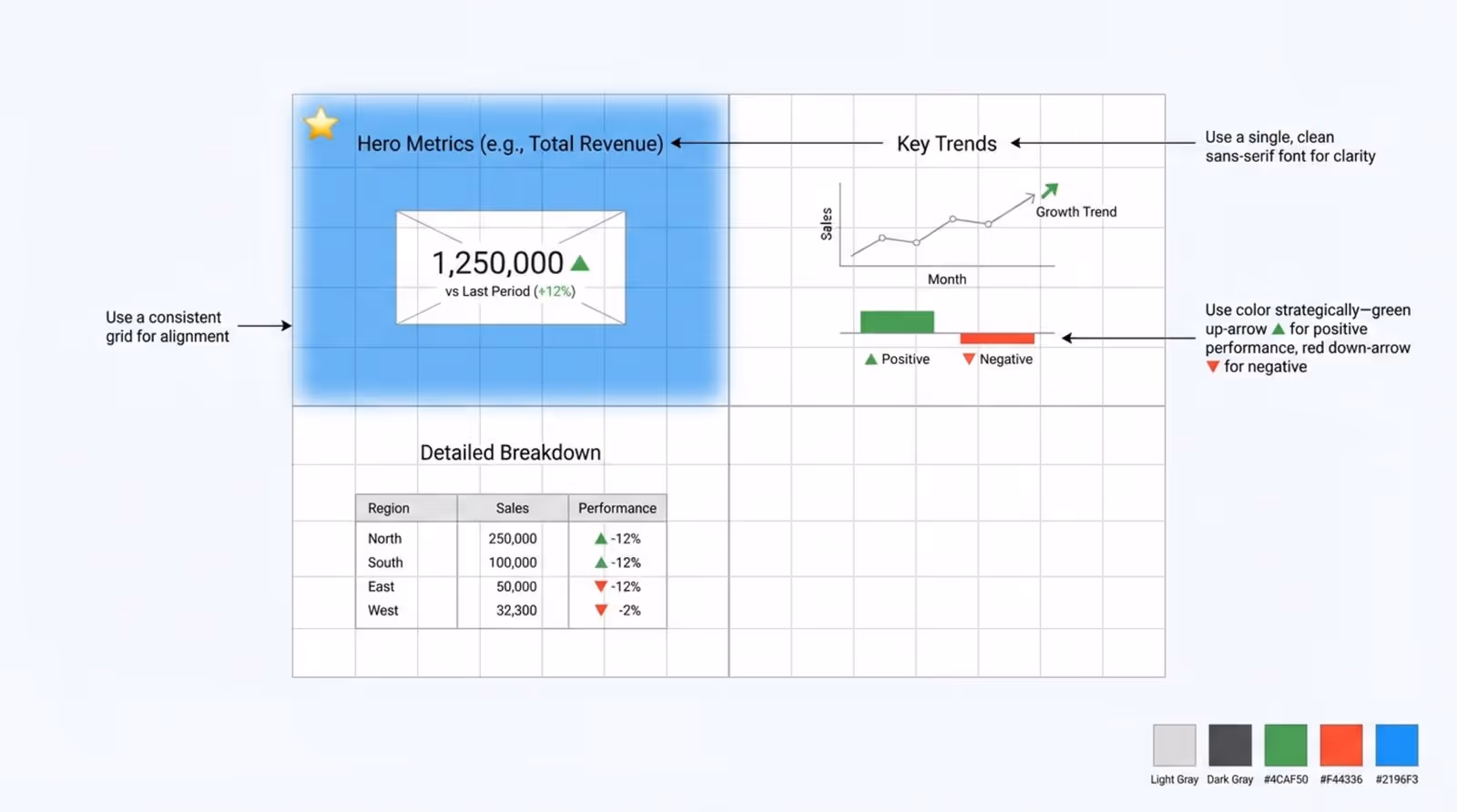
Layout dictates how users process information. People typically scan from top-left to bottom-right. Place your “hero” metrics-like total revenue or active users-in the top-left corner. Using a grid layout keeps the dashboard tidy. Stick to a limited color palette and one or two fonts to ensure readability and brand consistency.
Use color functionally, not decoratively. For instance, use red to signal missed targets and green for success. This gives instant context without requiring the user to read every number. Neutral tones work best for the background and structural elements, reserving bright colors for the data points that require attention.
Optimizing dashboards for performance and fast load times
To keep your dashboard responsive, focus on the data model. Complex DAX formulas and excessive slicers can slow performance. It is often better to clean and transform data in the back end (using Power Query or SQL) before it reaches the visualization layer. This reduces the processing load on the dashboard itself.
Limit the number of visuals on a single page. While a custom network graph might look impressive, it consumes more resources than a standard bar chart. Regularly review your dashboards to remove unused tiles. Remember, dashboards are summaries; if you need dozens of charts to explain a concept, that content belongs in a detailed report.
Top Power BI Dashboard Examples by Use Case
Examining real-world examples is the best way to understand Power BI’s capabilities. From sales trackers to emergency room monitors, these examples show how different departments tailor the platform. By studying these templates, you can learn which visuals-like waterfall charts for variance or decomposition trees for root causes-tell the best story for your data.
Many of these examples are available as .pbix files, allowing you to inspect the data model and adapt them. They serve as a professional starting point for building your own internal tools.
Sales and revenue dashboards
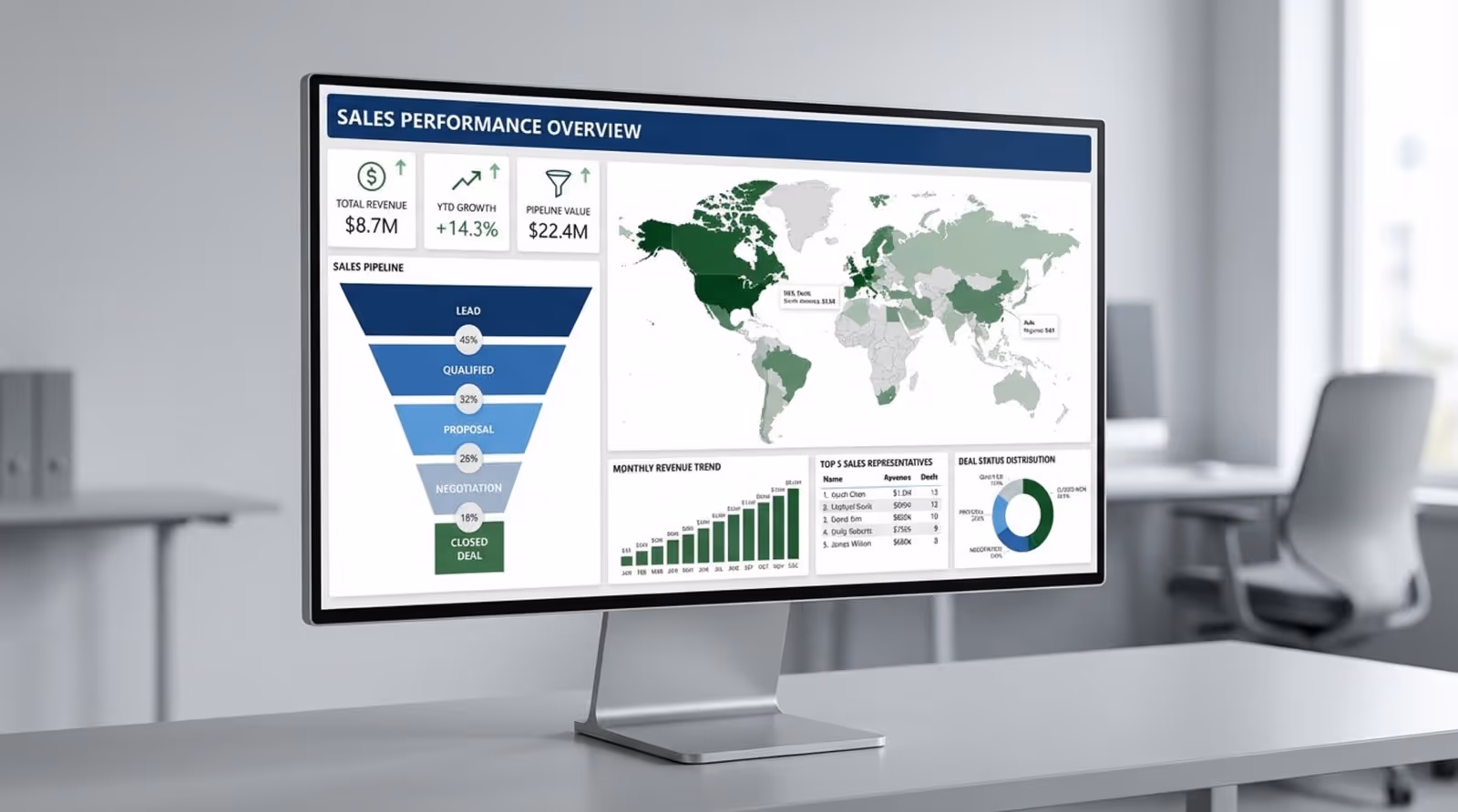
Sales dashboards are a staple of business intelligence. A solid Sales Performance Dashboard provides a complete view of pipeline health. It often uses funnel charts to visualize the conversion path from lead to deal. With filters for region and sales representative, managers can quickly identify where deals are stalling.
The classic AdventureWorks example demonstrates how to track total sales and growth over time, with drill-down capabilities into product categories. These dashboards often include maps to show sales density, helping leadership decide where to focus marketing efforts or open new locations.
Finance and budget tracking dashboards
Finance dashboards provide clarity on fiscal health. A Financial Analysis Dashboard typically tracks key ratios like Current Ratio and Earnings Per Share. These views allow CFOs to spot trends where costs might be outpacing revenue. This is ideal content for an executive boardroom screen to keep leadership aligned on fiscal discipline.
Budget tracking is equally important. A Revenue vs. Budget dashboard compares actuals against forecasts. Using combination charts, these dashboards highlight variance clearly, ensuring departments stay within their spending limits.
Marketing analytics dashboards
Marketing teams use dashboards to prove ROI. A Marketing Campaign Analysis report centralizes data on impressions, clicks, and conversions from various platforms (Google Ads, LinkedIn, Meta). This helps marketers allocate budget to the highest-performing channels.
For high-level views, a CMO Dashboard focuses on Customer Acquisition Cost (CAC) and Lifetime Value (CLV). This removes the granular channel detail, giving the Chief Marketing Officer the clear metrics needed to justify budgets to the board.
Social media and digital marketing dashboards
With multiple platforms to manage, an All-in-one Social Media Analytics dashboard is essential. It aggregates data from Facebook, Instagram, YouTube, and others, often combining it with web traffic data to show how social engagement drives site visits.
Platform-specific dashboards, like an Instagram Business Dashboard, dive deeper into demographics and engagement times. These insights help content teams refine their strategy to maximize organic reach.
Customer and CRM dashboards
Understanding your client base is key to retention. A Customer Insights Dashboard helps identify high-value accounts and analyze profit distribution. This supports targeted account management strategies.
CRM dashboards connected to Salesforce or HubSpot visualize deal velocity and win rates. By showing how long deals sit in each stage, sales leaders can pinpoint bottlenecks in the sales process and coach their teams effectively.
Retail and ecommerce dashboards
For online retailers, a Shopify Orders Dashboard is critical for tracking order volume, refunds, and top-selling products. This real-time visibility helps manage cash flow and inventory planning.
Physical retail chains benefit from a Supermarket Sales Dashboard. This tool breaks down sales by category and location, often overlaying staffing costs. Displaying this data in regional offices helps managers keep stores staffed appropriately for demand peaks.
HR and workforce analytics dashboards
Modern HR dashboards go beyond headcounts. An HR Analytics Report visualizes diversity metrics, hiring efficiency, and turnover. These insights are vital for companies committed to building inclusive workforces.
Workload monitoring is another valuable use case. An HR Workload Overview helps identify teams at risk of burnout by tracking capacity and tenure. This data supports better resource planning and retention strategies.
Supply chain and operational dashboards
Operational dashboards keep the business running smoothly. An Operational Efficiency Dashboard might track customer support metrics like ticket volume and resolution time. Displaying this on a wall-mounted screen in the support center keeps the team focused on service levels.
In logistics, a Supply Chain Dashboard tracks goods in transit and delivery performance. Identifying bottlenecks in distribution routes allows companies to optimize their network and reduce shipping costs.
Healthcare and patient analytics dashboards
Healthcare dashboards directly impact patient care. A Hospital Emergency Dashboard consolidates data on bed capacity, staffing, and patient intake. This allows administrators to manage patient flow efficiently during high-traffic periods.
During health crises, public-facing dashboards have been essential for tracking infection rates and recovery trends, helping both officials and the public make informed safety decisions.
Executive KPI and business overview dashboards
An Executive Insights Dashboard serves as the single source of truth for leadership. It highlights top-level drivers like year-over-year profit change, providing enough detail for strategy without getting lost in operations.
For SaaS companies, tracking Monthly Recurring Revenue (MRR) is vital. These dashboards show churn, new bookings, and growth trends, helping CEOs steer the company toward long-term targets.
Power BI Dashboard Example Breakdown
To master Power BI, it helps to deconstruct successful dashboards. Every effective example starts with clean data and purposeful visual choices. By understanding the "why" behind the design, you can build custom tools that solve specific problems for your organization.
Whether it is a supply chain monitor or a marketing overview, the core components remain consistent: user focus, logical hierarchy, and simplicity. Once you understand these blocks, you can move beyond templates.
What insights can you gain from these dashboards?
Dashboards reveal trends and patterns that are invisible in spreadsheets-such as a slow erosion of margins or a correlation between weather and foot traffic. They also highlight anomalies instantly. A sudden drop in server uptime or a spike in product returns stands out on a chart, allowing teams to react before the issue escalates. Ultimately, they turn raw data into a clear call to action.
Who can benefit from each dashboard example?
Power BI serves every level of the organization. Executives use strategic dashboards for long-term planning. Managers rely on operational views to balance resources. Individual contributors use personal dashboards to track their own goals.
External stakeholders also benefit. Agencies use dashboards to transparently show campaign results to clients, while boards use them to monitor governance. Clear visuals ensure everyone is looking at the same reality.
Key visualization types used in each example
Different data requires different visuals. Funnel charts are standard for sales and hiring processes. Decomposition trees are excellent for root-cause analysis, breaking down a top-level metric into its contributing factors. Waterfall charts explain how a starting value (like gross revenue) becomes a final value (like net profit).
Gauge charts are perfect for showing progress toward a goal, while maps handle geographic data. Choosing the right visual ensures the user understands the data immediately without needing an explanation.
Tips to Improve Your Power BI Reports with Dashboards
Improving reports means shifting from "showing data" to "enabling exploration." A good dashboard invites questions. By refining your design and avoiding common pitfalls, you create tools that people actually want to use.
Remember, a dashboard is never finished. As business goals shift, your dashboards should evolve. Regular feedback and continuous learning will keep your reporting sharp.
Interactive elements to keep users engaged
Interactivity distinguishes Power BI from static PDFs. Slicers allow users to filter data by time or category. Drill-through features let users click a summary metric to access the detailed report behind it. Tooltips can reveal extra context when hovering over a chart.
However, if you are displaying dashboards on digital signage screens via Look Digital Signage, remember that the audience is viewing passively. In that context, design for clarity without interaction-use large fonts and auto-refreshing data so the information is valuable even at a glance.
Common mistakes to avoid for clarity and usability
Overcrowding is the most common error. If a user cannot grasp the main message in five seconds, the dashboard is too busy. Stick to the essentials. Avoid using too many colors, which creates visual noise.
Weak data modeling is a technical pitfall. If your table relationships are incorrect, your visuals will display wrong numbers. Always validate your data model before focusing on the visuals.
Resources for learning and mastering Power BI dashboards
Microsoft offers extensive samples and documentation to help you learn. Exploring these official templates is a great way to see best practices in action. Platforms like DataCamp and the Power BI Community forums are also excellent resources for troubleshooting and advanced techniques.
The Business Intelligence market is growing rapidly, and data literacy is becoming a required skill. Mastering Power BI puts you ahead of the curve.
The real power of a dashboard is its ability to align a team. But a dashboard is only useful if it is seen. To ensure your key metrics are always visible to the people who need them, consider displaying your Power BI reports on office screens.
Look Digital Signage makes this simple. With the built-in Power BI app in the Look CMS, you can securely connect your Microsoft account and publish your dashboards to any screen in minutes. This ensures your teams stay focused on the metrics that matter, without complex IT setup. Whether you need to display sales figures on the floor or project KPIs in the boardroom, Look DS helps you get your data out of the laptop and into the real world.