Table of Content
How can you turn a standard coffee menu into a revenue-driving sales tool? The answer lies in combining a clear visual hierarchy with the right display format to guide customer decisions and speed up ordering. By strategically organizing items, using legible design, and leveraging modern display technology, you can streamline operations and boost your average ticket size.
The menu board is often the first meaningful interaction a guest has with your shop. It is more than a price list; it sets the tone for your brand and acts as your primary communication channel. When executed well, a menu cuts down on decision fatigue, which often pushes customers toward the cheapest option, and guides them toward high-margin specials and experiences they will remember.
Why a Well-Designed Menu Board Matters for Coffee Shops
Increases Sales Through Strategic Presentation
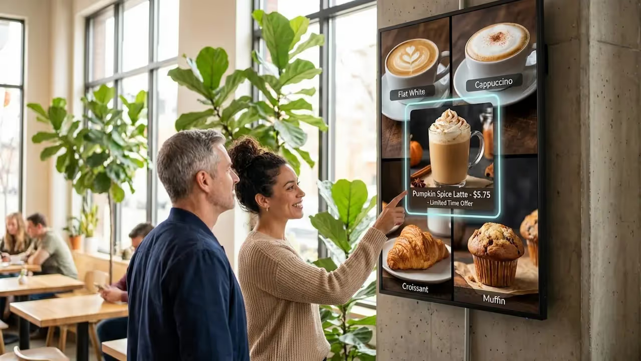
A smart menu board works like a silent salesperson. Industry data suggests that over half of customers are directly influenced by the menu board when making a purchasing decision. When you highlight bestsellers or seasonal items with distinct colors, borders, or subtle motion, you can spark impulse buys. Digital menus that utilize light movement-like steam rising from a cup-capture significantly more attention than static boards and can help increase unplanned purchases.
Strategic placement supports this effect. Placing high-margin drinks or new arrivals at eye level leverages natural reading patterns. When information is easy to find, customers are more willing to explore beyond their "usual," which can help improve ROI on every transaction.
Supports Branding and Customer Loyalty
Your menu board is a visual anchor for your brand. A cafe in a historic building might use painted wooden boards for a warm, classic mood, while a modern spot might choose digital screens to signal innovation and speed. Using consistent colors, logos, and fonts builds recognition and makes your space feel professional.
The board can also build loyalty by sharing your values. Whether you highlight sustainable sourcing or local bakery partners, the menu becomes part of your story. This helps customers feel connected to the business, not just the coffee.
Improves Customer Experience and Decision Speed
In a fast-paced environment, clarity is essential. Most customers cite an easy-to-read menu as a top factor in their dining experience. A clear layout with obvious sections, like "Espresso," "Teas," and "Food," helps people decide quickly, shortens the queue, and keeps operations running smoothly. This is critical for keeping customers happy during morning rushes.
Limiting sections to between three and seven items helps avoid choice overload. When guests feel confident in their choices, satisfaction goes up. A clear layout also supports your staff, as customers place orders more accurately, reducing friction for baristas.
Types of Coffee Shop Menu Boards
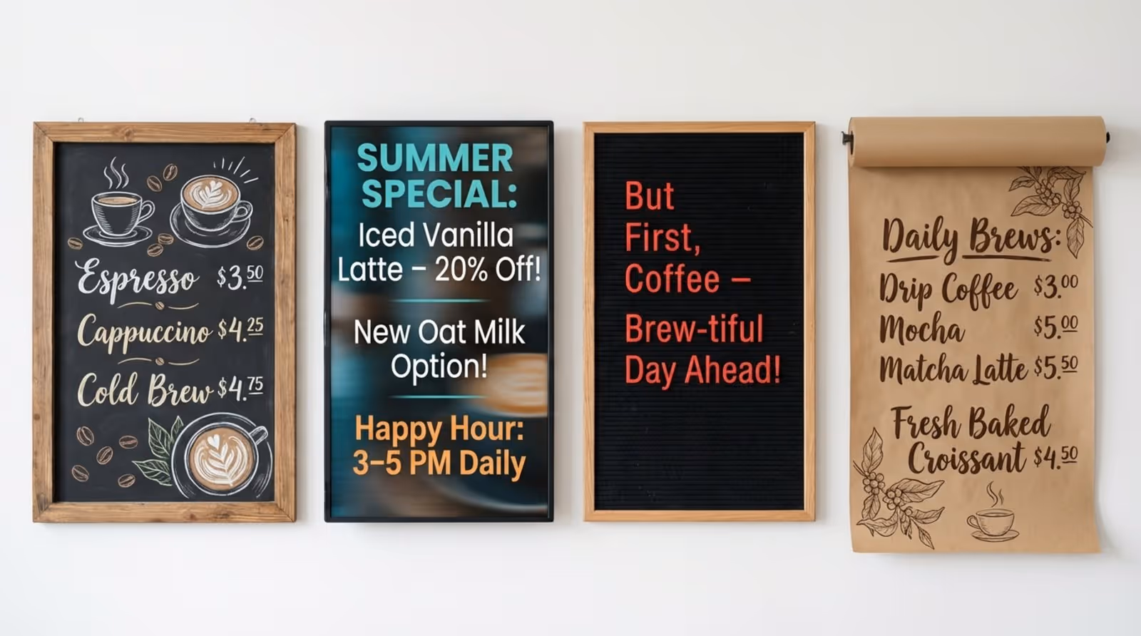
Chalkboard Menus: Timeless Appeal
Chalkboard menus are a staple for neighborhood cafes aiming for a handmade, approachable atmosphere. They are flexible, allowing you to update prices or specials manually without printing costs. Many shops use liquid chalk markers for cleaner text and add illustrations of cups or beans for personality.
While charming, they require staff with good handwriting and time to make manual updates. However, for shops that value a rustic aesthetic, the trade-off can be worth it to maintain a specific vibe.
Digital Menu Boards: Modern Flexibility
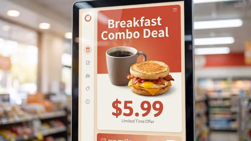
For shops that need to update content in minutes and keep queues moving, digital signage is the standard. Look Digital Signage is a strong fit for this environment, offering a cloud-based platform that lets you manage one or many screens from anywhere. With the Look CMS, you can use Smart Scheduling to automatically switch from morning coffee menus to afternoon lunch specials, ensuring the right content plays at the right time without manual intervention.
Digital boards also allow for rich visuals. Using ready-made templates within the Look system, you can quickly highlight high-margin seasonal drinks with professional imagery. This dynamic approach helps make premium items look more appealing, often encouraging customers to try something new.
Letterboards and Pegboards: Retro Inspiration
Letterboards and pegboards offer a vintage, tactile feel that suits minimalist or industrial spaces. They utilize plastic letters or pegs to form words, making them cost-effective to update. Their physical nature adds texture to your decor that screens cannot replicate.
Their main advantage is simplicity. Because physical space is limited, you are forced to keep descriptions short and scannable. For small shops with a stable menu, this delivers a clean, curated look.
Magnetic and Slat Boards: Quick Updates
Magnetic rail and slat boards use rows of wood or metal with removable panels. They provide a neat, organized appearance that feels polished yet grounded. They are useful for cafes that rotate beans or prices frequently, as individual tiles can be swapped in seconds.
Using magnetic headers like "Hot Drinks" or "Pastries" allows you to reorganize sections easily. You can use distinct magnets to flag new items, guiding the eye without cluttering the overall design.
Kraft Paper Rolls: Creative Simplicity
Kraft paper rolls involve mounting a large roll of brown paper on the wall. This style works well for pop-ups, bakeries, or artsy spaces. You can rewrite the menu daily, experiment with lettering, and add casual doodles.
This approach implies freshness and spontaneity. It suits concepts that change their menu constantly, inviting customers into a relaxed, informal environment.
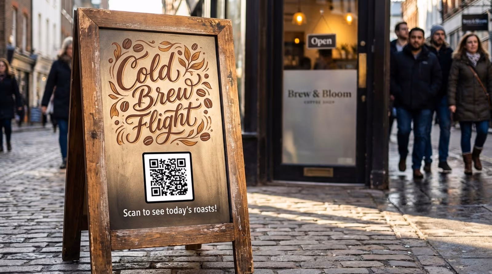
Outdoor and Freestanding Boards: Attract Passersby
Outdoor signage, such as A-frame sidewalk boards, is essential for foot traffic. Placed at eye level, they capture the attention of people walking by. Effective sidewalk boards can noticeably increase walk-in rates.
These signs should be double-sided and made from weather-resistant materials. They typically highlight a "hook"-like a signature drink or a witty quote-to draw people inside.
Interactive and Touchscreen Boards: Better Engagement
Interactive kiosks allow customers to browse descriptions, check nutritional facts, and customize orders. This technology is increasingly common in fast-casual settings to improve order accuracy and free up staff.
Some setups allow guests to build their own drinks on screen. This level of control can lead to higher satisfaction and ticket values, as customers often add more customizations when they have time to explore options.
How to Choose the Right Menu Board for Your Space
Comparing Menu Board Materials and Durability
Your material choice should align with your operational needs. Wood offers warmth and durability, while acrylic and metal provide a sleek, modern finish. Consider how often your menu changes; manual boards require physical labor for every price adjustment.
If you update content frequently, digital screens are often the most efficient long-term solution. Look Digital Signage supports Offline Playback, ensuring your menu keeps running even if the internet goes down, which is critical for maintaining professional appearances during service hours.
Space, Lighting, and Placement
Visibility is non-negotiable. Placing the menu above the counter is standard, allowing customers to decide while they wait. However, ensure the lighting is sufficient; darker spaces may require digital screens or backlit boards to ensure readability.
Vertical orientation works well for narrow spaces, drawing the eye upward, while horizontal layouts are better for wide service areas. Position the board at a comfortable height so customers do not have to strain to read it.
Balancing Budget, Maintenance, and Flexibility
While digital boards have an upfront hardware cost, they often save money over time by eliminating printing costs and reducing staff hours spent on manual updates. Chalkboards are inexpensive initially but require ongoing maintenance.
Consider the total cost of ownership. A printed board becomes expensive if you must reprint it whenever ingredient costs rise. Digital solutions like Look allow you to scale from 1 screen to thousands, adapting as your business grows without constant physical replacement costs.
Menu Layout Principles for Coffee Shops
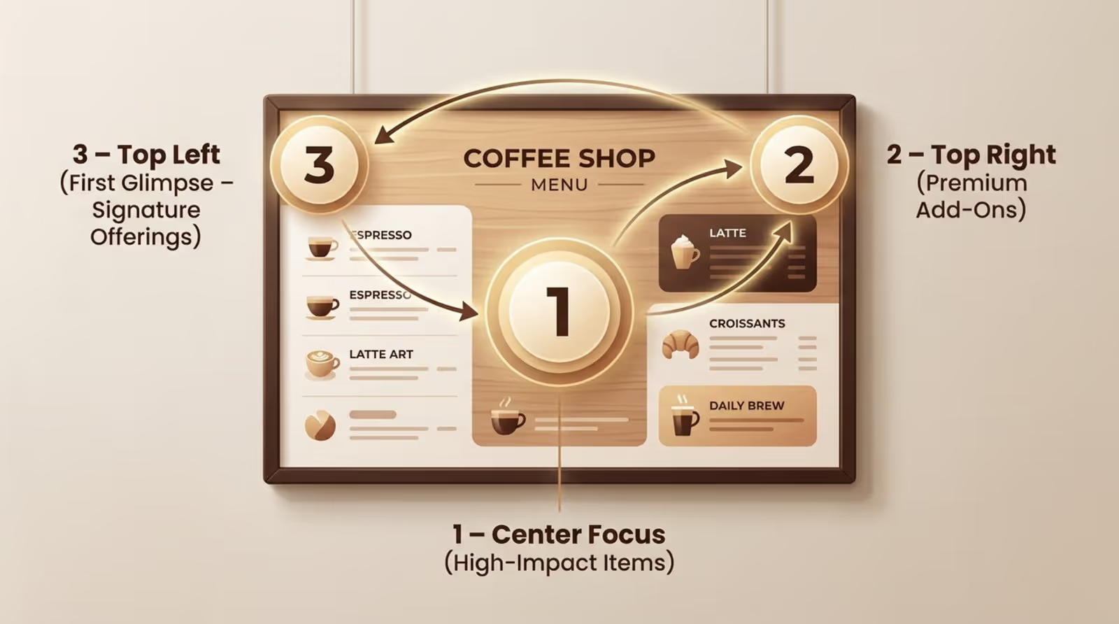
The Golden Triangle for High-Impact Design
Menu psychology points to the "Golden Triangle" reading pattern. Customers typically look at the center first, then the top right, and finally the top left. These are your prime real estate areas.
To maximize revenue, place your highest-margin signature drinks in these spots. By positioning standout items where eyes naturally fall, you increase the likelihood of them being ordered without aggressive selling.
Organizing Sections: Drinks, Food, and Specials
Structure is key. Group similar items clearly-"Hot Coffee," "Cold Brew," "Seasonal." If you serve food, separate it visually from beverages. Using lines or negative space helps the brain process information faster.
Keep add-ons like milk alternatives and syrups in a secondary section to avoid cluttering the main drink list. If space is tight, consider moving snack details to a display case label rather than the main board.
Highlighting Bestsellers and Signature Items
Use visual cues to guide choices. A box, a contrasting color, or an icon next to a "House Favorite" draws attention immediately. This helps undecided customers make a quick choice.
Signature drinks differentiate your shop. Brief, appetizing descriptions can make a "Honey Lavender Latte" sound irresistible, but keep the text concise to maintain readability from a distance.
Effective Pricing Strategies to Increase Spend
Pricing presentation affects perception. Many modern menus remove currency symbols to reduce the psychological "pain of paying." Listing a simple number (e.g., "4.5") often works better than "$4.50."
Avoid arranging prices in a straight column on the right, which encourages shopping by price alone. Ensure your pricing structure accounts for both ingredients and labor time to protect your margins.
Design Tips for Readability and Brand Impact
Font Size and Style for Easy Reading
Readability must come first. Select fonts that are legible from at least 10 feet away. While headings can be decorative, item names and prices should use clean sans-serif or serif fonts. Establish a clear hierarchy: largest text for headers, medium for items, and smallest for descriptions.
Avoid overcrowding the board. Small text frustrates customers and slows down the line. A simple test is to stand where the queue starts; if you cannot read it easily, your customers cannot either.
Color Choices and Contrast for Visibility
High contrast ensures visibility. Light text on dark backgrounds or dark text on light backgrounds are the safest choices. Avoid color combinations that vibrate or blend, such as red on green.
Use color strategically. A splash of color can highlight a "Limited Time" offer, but the overall palette should remain easy on the eyes. This is easily managed in digital formats using the Look CMS layout tools.
Consistent Branding Elements Across Your Board
Your menu should feel like a natural extension of your brand. Whether you are playful and bright or minimalist and serious, the design must match your interior and packaging. Consistency builds trust.
When customers see a unified visual identity across your signage, website, and cups, the business feels established and reliable. This professional polish contributes to the perceived value of your products.
Creative Coffee Shop Menu Board Ideas to Inspire
Daily Specials and Seasonal Menu Rotations
Keep your content fresh to encourage repeat visits. Seasonal rotations, like a pumpkin spice variant in autumn or a cold brew flight in summer, create urgency. Digital signage makes this easy; with Look Digital Signage, you can schedule these changes in advance so your board updates automatically.
Daily specials allow you to test new concepts with low risk. If a test item performs well, you can move it to the permanent menu. This data-informed approach helps you optimize your offerings over time.
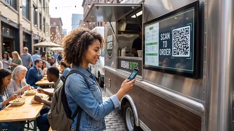
Interactive Elements: QR Codes, AR, and Customization
Technology can deepen engagement. A QR code on your board can link to farm-to-cup stories or nutritional information. Look CMS supports Interactive Scenarios, allowing you to incorporate QR codes directly into your digital layouts.
Even low-tech interaction adds value. A community board where customers vote on the next guest roaster fosters a sense of belonging. Engagement turns casual visitors into regulars.
Dividing the Board for Dietary Preferences and Themes
Accommodating dietary needs is essential. Dedicate a clear section for plant-based milks or gluten-free options. This inclusivity removes friction for customers with specific requirements.
Grouping items by theme, such as "Local Roasts" or "Global Origins," helps tell a story. These thematic sections make the menu easier to navigate and reinforce your brand's expertise.
Showcasing Local Collaborations and Sustainable Options
If you partner with local suppliers, highlight it. Calling out local bakeries or dairy farms appeals to community-minded customers. Small icons can quickly signal "Local" or "Organic."
Promote sustainability initiatives, such as discounts for reusable cups. This not only supports your eco-friendly values but also encourages behavior that reduces your disposable cup costs.
Common Menu Board Mistakes to Avoid
Overcrowding With Too Many Items or Small Text
Attempting to list every single item often leads to clutter. A crowded board is difficult to scan. If you have an extensive menu, use Screen Layouts in Look DS to organize zones effectively, or provide a printed handheld menu for the full list.
Focus your main board on high-profit items and core categories. White space is crucial for letting the eye rest and making key information stand out.
Inconsistent Updates and Outdated Information
Displaying out-of-stock items or incorrect prices frustrates guests and slows down service. Updates should be immediate. With a cloud-based solution like Look Digital Signage, you can update pricing or hide sold-out items across multiple locations in minutes, ensuring accuracy.
Regularly audit your menu. If an item isn't selling, use data to decide whether to rename it, reprice it, or remove it. Keeping your board optimized is an ongoing process.
Ignoring Accessibility for All Customers
Accessibility should be a priority. Ensure high contrast and sufficient font sizes for customers with visual impairments. If your main board is mounted high, keep a printed version accessible at the counter.
Clear allergen labeling is also a safety requirement for many customers. Using simple icons for common allergens helps keep everyone safe and speeds up the ordering process.
Key Takeaways for Creating an Effective Coffee Shop Menu Board
Your menu board is a living tool that should evolve with your business. Beyond aesthetics, consider how your menu system supports your operations. Tying your menu strategy to sales data allows you to prove ROI by focusing on high-performing items and removing dead weight.
Preparing for the future means adopting flexible systems. Whether you choose digital or physical formats, ensure you can make updates quickly and cost-effectively. Look Digital Signage provides the reliability and ease of use needed to keep your screens running smoothly, helping you present a professional face to every customer who walks through your door.
Consider the total cost of ownership. A printed board becomes expensive if you must reprint it whenever ingredient costs rise. Digital solutions like Look allow you to scale from 1 screen to thousands, adapting as your business grows without constant physical replacement costs.