Table of Content
Today, technology touches almost everything we do, and restaurants are no different. A restaurant digital menu is an electronic screen that shows what a restaurant offers in a lively, often interactive way, instead of using a fixed paper menu. These screens are quickly becoming standard in food service, changing how restaurants show their dishes and connect with guests. They might be big HD menu boards above the counter, tablets at the table, or mobile menus opened through a QR code. Digital menus aim to grab attention and make the dining experience better and smoother.
A digital menu can be very simple or quite advanced. It might be a basic screen that loops high-quality images of dishes, or an interactive display where customers can explore ingredients, see nutrition information, and place orders themselves. Moving from paper to digital is more than just looking modern. It can strongly influence how customers see your brand, how engaged they feel, and how much they spend. From family-style restaurants to quick-service restaurants (QSRs) and fast-casual spots, a well-planned digital menu board can be a powerful tool for growth.
How Does a Digital Menu Differ from Traditional Menus?
The gap between a digital menu and a printed one is large, mainly in what they can do and the kind of experience they offer. Once you print a paper menu, it doesn’t change until you design and print it again, which costs time and money. It shows text and maybe a few photos, but that’s it. Paper menus can be charming, but they don’t adapt easily to change and they feel flat.
Digital menus, on the other hand, are flexible and active. They can show sharp food photos, short videos of dishes being prepared, and interactive sections that let customers explore details. You can change dishes, prices, specials, or mark items as sold out in a few clicks and push updates to every screen at once. This real-time control removes the slow, manual work of replacing menus and keeps customers looking at correct information. Digital menus can also invite interaction in ways paper never could, fitting well with our habits of using touchscreens and expecting quick responses.
Benefits of Using Digital Menus in Restaurants
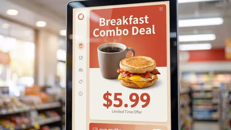
Digital menus bring many benefits beyond good looks. They can increase sales, improve operations, and raise customer satisfaction. One of the biggest pluses is the boost in customer engagement. Strong visuals, subtle animations, and interactive options make food look tempting and encourage people to explore more items. A single great photo can create cravings and push customers to try more dishes, which is especially helpful for lesser-known items where a picture explains what’s inside.

Digital menus also make daily work easier. You can adjust prices, update promos, or remove out-of-stock items right away-no reprinting needed. You can set content to change by time of day, so the menu naturally moves from breakfast to lunch to dinner. Digital menus can also show useful information like nutrition facts, ingredients, and allergen details, which matters a lot to guests with special diets. This level of clarity builds trust and attracts more people. Going digital also cuts paper use, reduces printing costs, and helps lower your environmental impact. On top of that, digital menus can highlight add-ons, combos, and loyalty programs, increasing average ticket size and encouraging guests to come back.
Key Design Principles for a High-Quality Restaurant Digital Menu
Designing a strong restaurant digital menu means balancing beauty and ease of use. The goal is more than listing dishes; it’s building a sales tool that shapes decisions and supports revenue. Every detail-from fonts and colors to image placement-affects how guests feel about your brand and how easy it is for them to order. You want a menu that looks good, is simple to move through, and gently guides guests toward dishes you most want to sell.
The process should start with a clear view of your brand and your target customers. This base will guide all other choices so the menu feels like a natural part of your restaurant’s look and message. From there, careful choices about typography, photos, color, and layout are key. A strong digital menu should feel natural to use, welcoming, and clearly connected to the level of quality your restaurant offers.
Maintain Branding Consistency Across the Menu
Consistent branding is central to a clear restaurant identity, and your digital menu is one of the best places to show it. The menu should match your restaurant’s overall style-colors, fonts, tone of voice, and visual style-so guests feel a single, unified experience. When everything, from wall decor to the digital screens, fits together, people feel more comfortable and confident. That comfort often leads to longer visits, bigger orders, and more repeat business.
Use your brand’s main colors, logo, fonts, and image style across the digital menu. A modern, sleek restaurant might use minimal layouts and clean, sans-serif type. A warm, rustic place might use soft tones and handcrafted-style fonts. Even small family-run restaurants can create a strong, consistent look with digital menus. Because digital designs are easy to change, you can keep the menu in step with your brand as it grows or shifts over time.
Prioritize Legibility with Typography and Contrast
If guests cannot read the menu easily, nothing else matters. People need to scan items quickly, often from several feet away and in busy surroundings. That means font choice and color contrast are extremely important. Choose simple, clear fonts and avoid overly decorative styles for item names and descriptions. Fonts like Arial, Helvetica, or Open Sans in larger, bold sizes usually work well.
You also need a strong contrast between text and background. Black text on a light background or white text on a dark background is usually easiest to read. You can use brand colors, but they must still stand out clearly from the background. Avoid color pairs that blend together or strain the eyes. If reading the menu is hard work, guests get tired, delay ordering, or feel annoyed. The text should be easy to read at a glance so people can focus on choosing food, not decoding the screen.
Use High-Quality Images and Professional Photography
On a digital menu, great images can sell more food than any paragraph of text. Sharp, well-lit photos do more than make the screen look pretty; they help guests understand what they’re ordering and spark real cravings. A good photo can push someone to try two or three dishes instead of one, especially when the dish is unfamiliar and the picture clears up any questions.

Because of that, paying for professional photography is a smart investment. Phone snapshots or shaky videos rarely show your food at its best. You want bright, clean, carefully arranged shots that highlight details and texture. You don’t need a photo for every single item unless you exclusively serve unusual dishes. Focus on your main sellers, high-margin items, specials, and visually striking plates. Simple, neutral backgrounds keep attention on the food itself. Strong food photography suggests quality, care, and professionalism, and helps win trust quickly.
Use an Appealing and On-Brand Color Palette
Color strongly affects mood and appetite, so your color choices matter. Your menu colors should match your brand and also support how you want guests to feel. Different colors send different signals: red feels energetic and can stimulate appetite; yellow suggests warmth and speed, often fitting fast-service spots; green signals freshness, health, or plant-based options; blue can signal trust and calm but is rarely used for food itself because it doesn’t appear often in nature.
Accent colors can draw attention to specials, combos, and high-profit dishes. If your original brand colors weren’t chosen with screens in mind, you can extend your palette slightly to work better on digital displays. Just avoid filling the screen with too many bright tones. Too much color can feel messy and distracting. Test different color setups, watch how guests respond, and adjust based on what helps them order quickly and buy more confidently.
Improve Readability with Spacing and Simple Layouts
A clean, organized menu helps customers feel relaxed and in control. Good spacing, often called “white space,” gives each element room to breathe and makes the layout feel clear instead of busy. When there’s enough space between sections and items, eyes can move naturally around the screen and find key information without effort.
Keep the layout simple. Avoid big chunks of dense text. Break content into logical groups using headings, columns, and rows. Show only what’s needed on each view; don’t try to cram every detail onto one screen. Too much text and too many images at once can overwhelm people and slow down decisions. A simple, tidy layout helps guests quickly locate the category they want and feel confident in their choices.
Structure the Menu Logically for Fast Navigation
A well-structured menu feels like a smooth, guided path through your offerings. People usually scan from left to right and top to bottom, and they tend to think about meals in order: starters, then salads/soups, then mains, then desserts. Set up your menu to match that pattern so guests don’t waste time hunting for things.
Use clear headings like “Starters,” “Burgers,” “Pasta,” “Desserts,” and “Drinks.” You can add extra sections such as “Daily Specials,” “Kids,” or “Vegan & Gluten-Free.” This keeps the screen neat and makes the experience less stressful. Place your most important information where people look first, usually near the top and left side, and consider putting certain promotional or loss-leader items near the bottom right to influence choices subtly. A menu that’s easy to scan leaves a better impression and can influence whether people want to come back.
Practical Menu Organization Strategies
Beyond the look and feel, the way you group and present items has a major impact on how people order. You are not just listing dishes-you are guiding decisions. Smart organization can lower stress, move guests toward profitable dishes, and keep the kitchen running smoothly.
Try to think like your customer. How would they naturally look through this menu? What do they want to see first? Which details must be obvious right away? With those questions in mind, you can group items in ways that feel natural and helpful instead of confusing.
Divide Menu Items into Clear, Intuitive Sections
One of the best ways to reduce confusion is to split your menu into clear categories. Like a bookstore separates sections, your digital menu should keep similar dishes together. Common categories include starters, mains, desserts, and beverages, plus possible sections for “Lunch Specials,” “Vegetarian,” or “Gluten-Free.”
These distinct groups make the menu easier to scan and more pleasant to look at. When guests can quickly jump to what they want, they feel more relaxed and confident. That smoother experience improves how they view your restaurant and speeds up the ordering process.
Limit Menu Choices to Prevent Decision Fatigue
Endless options can sound attractive, but in practice they often backfire. When people see too many choices, they can freeze, feel stressed, or delay ordering. This “decision fatigue” can hurt both guest satisfaction and sales.
A shorter list of well-chosen dishes often works better. It helps guests choose faster and lets your kitchen focus on doing each dish very well. Research has shown that trimming choices can actually raise sales, because people are less overwhelmed and more likely to pick something. You still offer variety, but in a curated way that highlights what you do best.
Use Boxes, Icons, and Visual Cues for Focus
Visual cues help guide attention and make the menu easier to scan. Grouping items into subtle boxes or panels can make sections clearer and highlight certain items like signature dishes or popular combos.
Small icons can quickly signal key traits without long text. For example:
- 🌶 (or a flame icon) for spicy dishes
- 🌱 (or a leaf) for vegetarian/vegan items
- ★ for chef’s specials or customer favorites
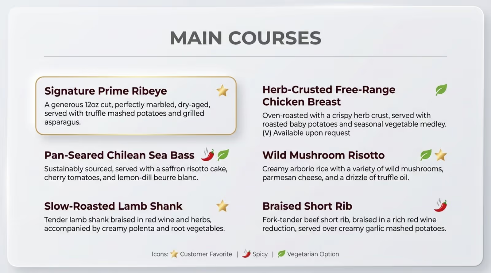
Horizontal lines or shaded bars can also separate course types and keep things tidy. These simple markers draw the eye where you want it and help guests find what matters to them faster.
Position Premium or Signature Items Strategically
Where you place items on the screen influences what people notice first. Guests usually see the upper parts of the screen and the right-hand areas more strongly. The first prices they see also create an “anchor” in their minds for what seems normal or high.
You can use this effect by placing premium or signature dishes where eyes naturally land-such as near the top or on the right side of a list. Bold fonts, slightly larger images, or accent colors can further highlight these items. This doesn’t force anyone to choose them, but it gently nudges more attention-and often more orders-toward your most profitable or standout dishes.
Making the User Experience Better with Advanced Features
A digital menu can be much more than a static slide show. With modern tools, it can become an interactive, engaging part of the dining experience that informs guests, entertains them, and supports sales goals.
By making your menu easy to use on different devices, adding motion and animation carefully, and promoting the right offers at the right times, you can turn your displays into powerful, active sales tools.
Make the Menu Mobile-Friendly and Responsive
Many people now check menus on their phones before or during their visit. That means your menu must work well on small screens. A responsive design automatically reshapes the layout to fit any device, whether it’s a large TV, a tablet, or a smartphone.
Keep mobile in mind by:
- Using font sizes that are readable without zooming
- Keeping tap targets large enough for fingers
- Compressing images so the menu loads quickly
- Avoiding heavy videos that slow everything down
If the menu loads fast and is easy to scroll on a phone, you reach more people and reduce frustration for hungry guests on the go.
Add Interactive Elements and Motion Graphics
Thoughtful motion and interaction can make your digital menu feel alive. Motion graphics use moving images, text, and sometimes sound to tell a quick story, present an item, or bring attention to specific content. For example, a short loop could show a burger being assembled or coffee being poured.
Subtle animation can:
- Highlight new or featured dishes
- Bring gentle attention to your logo or brand elements
- Guide the viewer from one section to another
Use smooth fades, soft pulses, or light transitions. Avoid fast, flashy animations that distract from reading. The motion should support the menu, not fight with it. Always match animation style and speed to your brand’s tone-calm for fine dining, playful for casual spots, and so on.
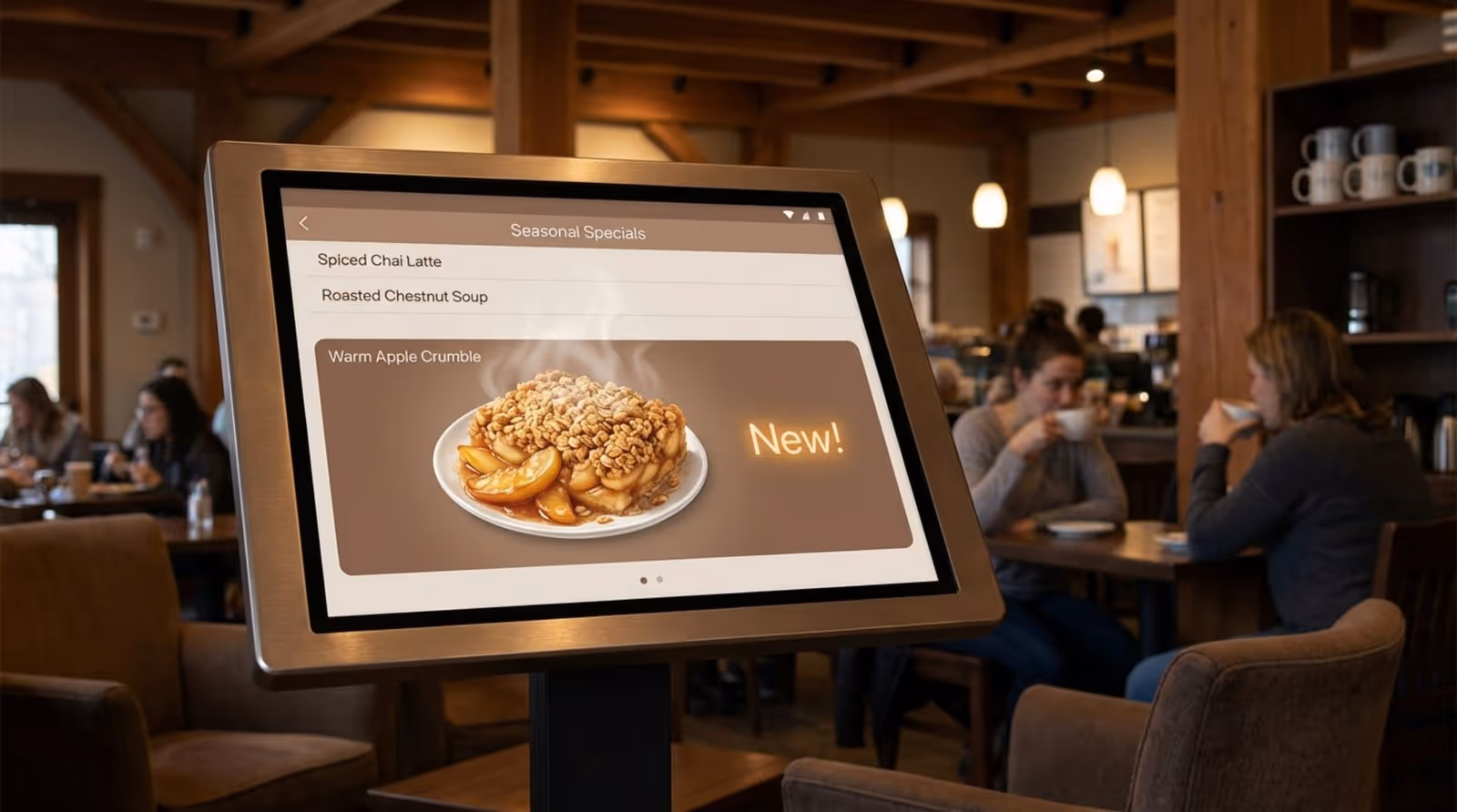
Highlight Promotions, Specials, and Seasonal Offers
Digital menus are perfect for calling out deals and limited-time items. You can give specials a dedicated area or even an entire screen rotation so they stand out. Use brighter accent colors, larger fonts, or small graphics (like snowflakes in winter or a sun for summer drinks) to catch the eye.
To increase urgency, use simple phrases that show limited availability, such as “Today Only,” “Weekend Special,” or “This Month’s Feature.” You can also promote bundles and set menus that raise average spend. Because screens are easy to update, you can quickly test different offers and see which ones draw attention and sales.
Include Clear Calls-to-Action for Upselling
Calls-to-action (CTAs) guide customers to do something specific, beyond just looking. On digital menus, CTAs might invite guests to place an order, see more details, or add extras to a dish. Examples include:
- “Order Now”
- “Add Fries & Drink”
- “See Dessert Menu”
- “Make a Reservation”
CTAs should be short, clear, and easy to spot. Use contrasting colors, buttons, or icons, and place them where eyes naturally go-near item descriptions or at the bottom of a section. In interactive menus, you can suggest sides, sauces, or drinks related to what someone is viewing, which helps raise order value in a natural way.
Design Considerations for Digital Menu Displays
Good content still needs the right “canvas.” The physical screens you use-size, brightness, and placement-strongly affect how easy it is for guests to see and use the menu. A beautiful design can fall flat if the display is too dim, too bright, or too small for the space.
Choosing the correct hardware and adjusting your layout for different screens helps turn your design work into a real, practical tool guests can rely on.
Choose Screen Size and Brightness for Visibility
Screen size should match your room and viewing distance. A very large screen in a tiny cafe can feel overpowering, while a small screen in a big dining room may be hard to read. Consider:
- How far away people stand or sit when reading
- How much content you need to show at once
- How many screens you plan to use side by side
Brightness (measured in nits) is also a key factor. For normal indoor spaces, around 350-500 nits is usually fine. If the screen is near windows with daylight, you may need around 500-800 nits. Outdoor or drive-thru displays often need 2,500 nits or more so they stay readable in bright sun. Try to match brightness to your lighting; a screen that’s much brighter than the room can be harsh, while a dim one in a bright area will be hard to see.
Adjust Layout for Different Display Types
Digital menus can live on many devices: wall-mounted displays, countertop screens, tablets, and phones. Each one has different size, shape, and viewing distance, so one layout rarely fits all.
General guidelines:
- Large overhead screens: Use big text, simple layouts, and fewer details. People see them from far away and for short periods.
- Tablets or kiosks: You can include more detail, filters, and search options because guests can tap, scroll, and spend more time.
- Mobile phones: Use responsive layouts that stack content vertically, with clear buttons and simple navigation.
Consider building a few layout versions based on screen type, and keep fonts, colors, and style consistent so guests recognize your brand instantly on any device.
Use White Space to Direct Attention
White space (empty areas around items) is one of your most useful layout tools. It keeps the menu from feeling packed and helps the eye separate sections and items. This “breathing room” makes the display more readable and more pleasant to look at.
Place enough space between headings, item lines, and images. This creates natural visual groups and makes it easier for guests to move from one element to the next. When the screen feels calm instead of busy, people can focus better on what you want them to notice-like your specials or signature plates.
Selecting and Implementing Digital Menu Software
The software behind your screens is just as important as the graphics on them. It controls how you create, edit, schedule, and monitor your digital menus. The right platform should support your brand vision, make updates simple, and connect smoothly with your existing systems.
Choosing software means comparing features, checking compatibility, and making sure your team can use it without constant outside help. Once you pick a platform, good setup and ongoing fine-tuning help you get the most benefit from your digital menu boards.
What Features to Look for in Digital Menu Software?
Choosing digital menu software is like choosing the engine for your car: it affects everything. You need something reliable, easy to use, and flexible enough to match your needs. Key features to look for include:
Paid, cloud-based systems often cost about as much as a streaming service each month but offer far more control and tools than free options, and they usually pay for themselves through better sales and smoother operations.
Integrating Menu Boards with Restaurant Operations
Digital menus work best when they’re part of your daily routine, not a separate piece of tech. Integration means linking screens with your kitchen, front-of-house, and management workflows.
Examples include:
- Automatically hiding items when they sell out to avoid customer disappointment
- Switching menus by time so staff don’t need to remember to change boards
- Showing promos or upsell suggestions based on time of day or traffic patterns
Some advanced systems can even respond to sensors or customer behavior, showing different content when people approach. The more your digital menu system syncs with real operations, the more value it adds.
Customizing Templates for Branding and Flexibility
Most modern digital signage tools offer templates so you don’t have to start from a blank screen. These templates are flexible; you can match them closely to your visual identity.
Within a template you can:
- Change colors and fonts to match your brand
- Add your logo and brand imagery
- Resize and move images and text blocks
- Adjust sections for your menu types (pizza, sushi, burgers, etc.)
This lets you get a professional look quickly, while still giving you room to be creative and adjust over time. You can also keep multiple versions ready-weekday vs. weekend menus, seasonal boards, or event-specific layouts-and switch between them easily.
Increasing Engagement and Measuring Success
The real power of a digital menu isn’t just to display items-it’s to attract attention, shape choices, and support your business goals. That means you need both strong visual design and a system for measuring what’s working.
By watching how guests respond and using the data built into your software, you can keep improving your menu so it sells more effectively and keeps customers happy.
Use Visual Appeal to Boost Customer Interaction
People are naturally drawn to bright, sharp screens and well-presented food. Strong visuals can quietly “sell” your dishes all day. High-quality photos and well-framed videos tell a story: they show texture, color, and freshness in a way words can’t.
Along with still photos, you can:
- Use short video clips of dishes being plated or drinks being poured
- Add subtle motion to backgrounds (like slowly moving steam or bubbles)
- Animate text and icons lightly to draw attention to key areas
When your menu looks this good, guests explore more, consider extra items, and feel more excited about what they’re ordering.
Track Analytics and Customer Behavior
Unlike paper menus, digital menus can give you clear usage data. Many platforms show which items appear most often, which screens get the most views, and how promotions perform over time.
Useful metrics include:
- Most-viewed items or sections
- Items with high views but low sales (which may need better photos, copy, or pricing)
- Impact of feature spots or promos on item sales
By reviewing this information regularly, you can adjust item placement, visuals, and offers to match actual guest behavior instead of guessing.
Adjust Menus and Promotions Based on Feedback
Digital menus are easy to change, which makes them perfect for ongoing improvement. Use feedback from both customers and staff, together with your analytics, to refine what you show and how you show it.
For example:
- If guests keep asking for more plant-based options, create a visible section and highlight it.
- If a special doesn’t sell, try a better photo, clearer description, or different price point.
- If staff often answer the same questions, add that information to the screen or to a linked mobile view.
This cycle-test, watch, adjust-keeps your menu current, useful, and appealing.
Best Practices for Updating and Maintaining Digital Menus
A digital menu needs steady care. Its main strength is that it can change quickly, but that only helps if you actually keep it updated. Outdated prices, old promos, or missing items harm trust and make the restaurant look careless.
Good maintenance includes both regular content updates and making sure staff know how to use and support the system.
Schedule Regular Content Updates
Plan a routine for menu edits rather than waiting until something is obviously wrong. This includes:
- Rotating seasonal dishes and limited-time offers
- Adding new items and removing underperforming ones
- Refreshing photos or layouts occasionally so the menu doesn’t feel stale
Use your software’s scheduling tools to automate changes by time and date. For example, have breakfast menus appear in the morning and switch to lunch without staff input. Regular, small updates keep the menu feeling fresh and accurate, and they give guests reasons to come back and see what’s new.
Train Staff on Digital Menu Management
Your team needs to feel confident working with the digital menu system. Even if they’re not full-time managers of the content, they should know the basics.
Training should cover:
- How to mark items as sold out or back in stock
- Who to contact and what to do when something looks wrong on screen
- How the menu highlights specials or key items so staff can support that in conversation
Hold short refreshers when you add new features or layouts. Encourage staff to share what they hear from guests; those insights can guide future tweaks to the design and content.
Frequently Asked Questions about Restaurant Digital Menu Design
As more restaurants add digital menus, similar questions come up again and again. Getting these details right can help you avoid mistakes and tap into the full value of digital displays.
What are Common Pitfalls in Digital Menu Design?
Some frequent mistakes reduce the impact of digital menus:
- Too much content on one screen: Crowded layouts with many images and long text blocks overwhelm customers.
- Poor readability: Fancy fonts, tiny sizes, or weak contrast make it hard to read items from a distance.
- Low-quality or overused images: Blurry or badly lit photos hurt your brand; showing a picture for every single dish can be distracting unless the cuisine truly needs that level of visual guidance.
- Inconsistent branding: Mismatched colors, fonts, or styles make the menu feel unprofessional.
- Slow loading on mobile: Heavy files lead to long wait times and frustrated visitors.
- No clear actions: If there are no prompts to order, see more, or scan a QR, the menu becomes passive instead of helpful.
- Rare updates: Old specials, wrong prices, or items that are no longer served quickly damage trust.
Should Prices Include or Omit Currency Signs?
Whether to show a currency symbol (like “$”) next to each price is a small design choice that can affect how guests feel. Many modern restaurants choose to leave off the symbol. The idea is that guests come mainly for the experience and the food, and putting less attention on the “money sign” keeps the focus on value and enjoyment.
Omitting the symbol can also make the menu look cleaner and less like a price list. Some places also skip “.99” endings and use rounded numbers instead, which can look more modern. There’s no single correct answer, so you can test both versions and see which works best for your location, concept, and audience.
How Can Digital Menus Cater to Dietary Preferences?
More guests now have special diets or allergies, and digital menus are well suited to support them. You can share more detail than a paper menu allows, and you can update information easily when recipes change.
Helpful options include:
- Icons for vegetarian, vegan, gluten-free, dairy-free, nut-free, and similar needs
- Filters or search tools on interactive screens so guests can show only items that match their preferences
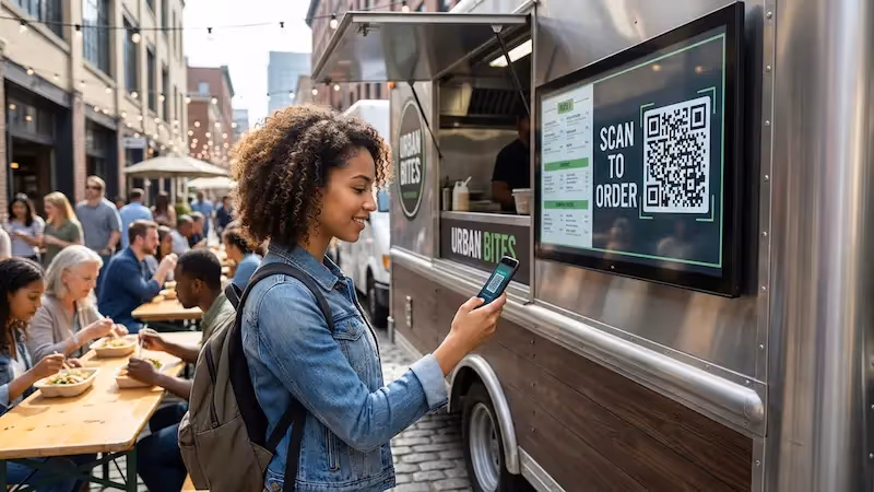
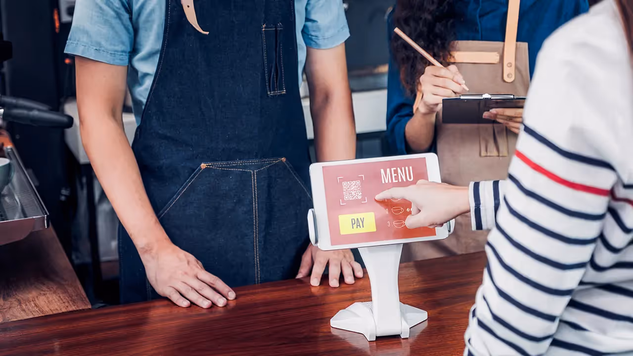
- QR codes that link to a mobile page with full ingredient lists, nutrition facts, and allergen warnings
Clear labels and accessible details make guests feel safe and respected, reduce questions for staff, and open your restaurant to a wider range of customers.