Where digital signage goes in a museum
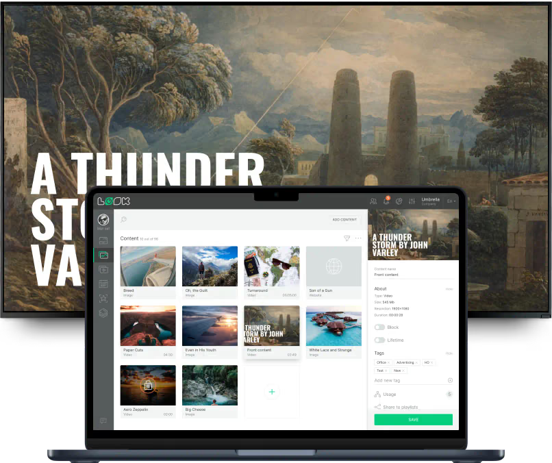
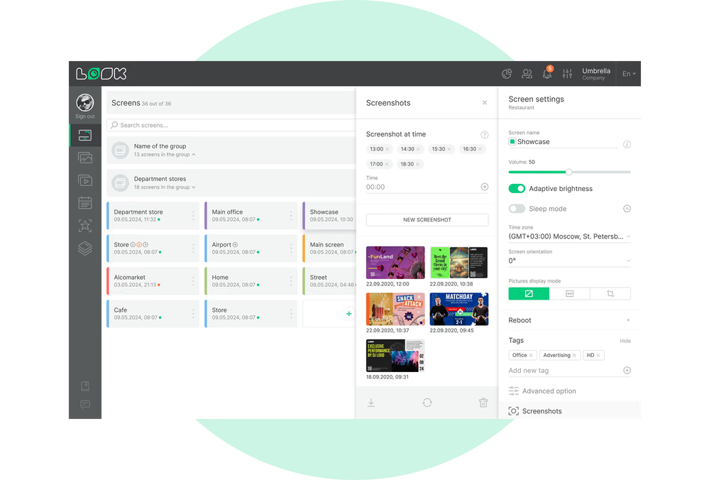
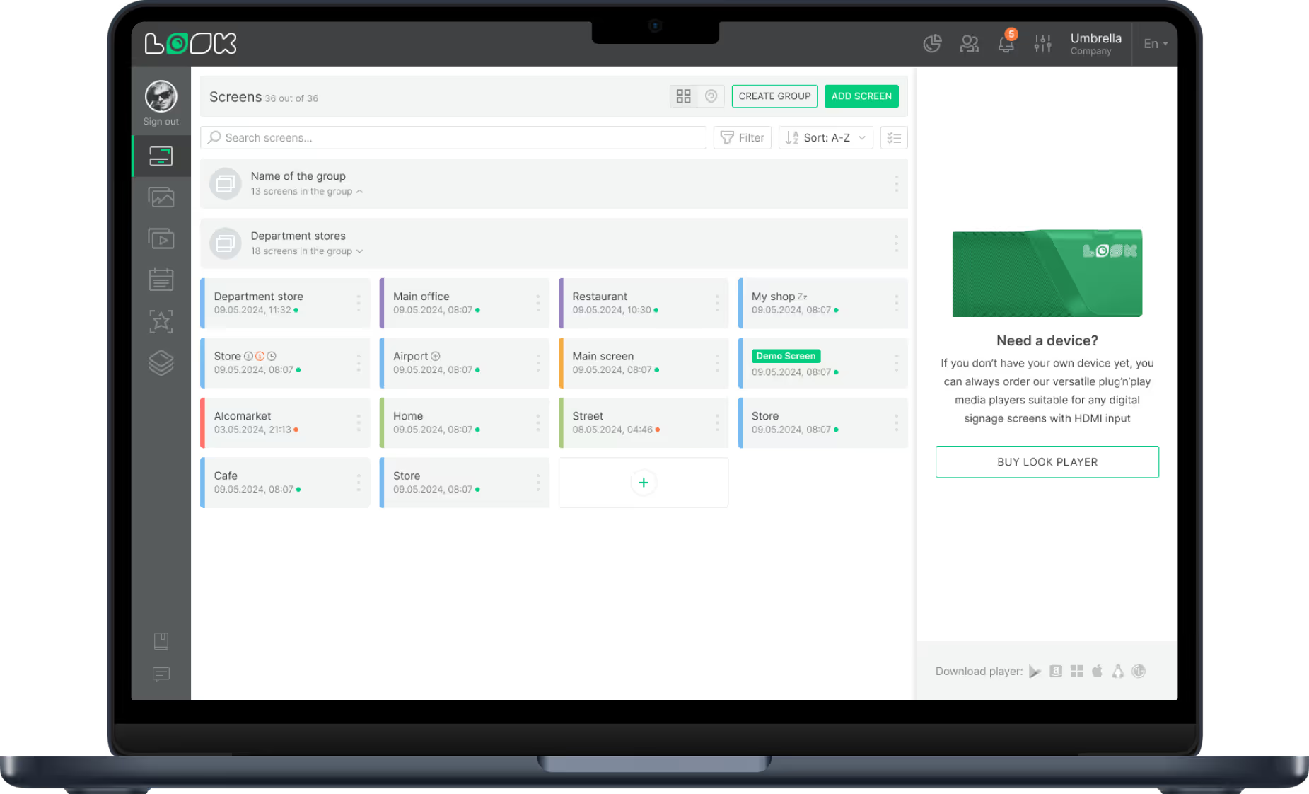
The same visitor meets the entrance lobby, a gallery wall, a kiosk and the shop counter at different points of one visit. Look runs all of them from a single account, each keeping its own layout, schedule and publishing rights.
Entrance, lobby and ticket desk
Answer the first five questions before anyone asks.
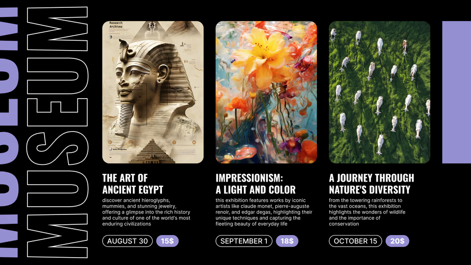
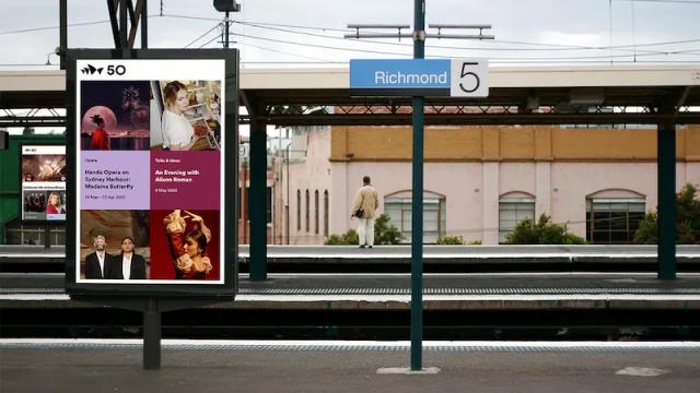
Screens above the ticket desk show opening hours, admission prices, timed-entry slots, today's talks and tours and current gallery access, so visitor services answers fewer repetitive questions.
The Calendar app reads today's program from the museum's own calendar, and a closure published from a browser reaches every screen tagged for the entrance.
Best for: Opening hours, admission and timed entry, today's program, gallery closures, house rules
Galleries and exhibit labels
Replace the reprint with an edit.
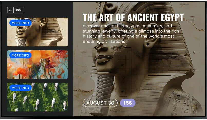
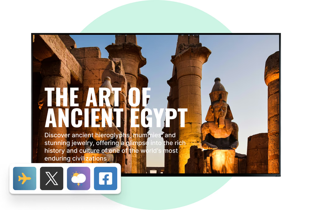
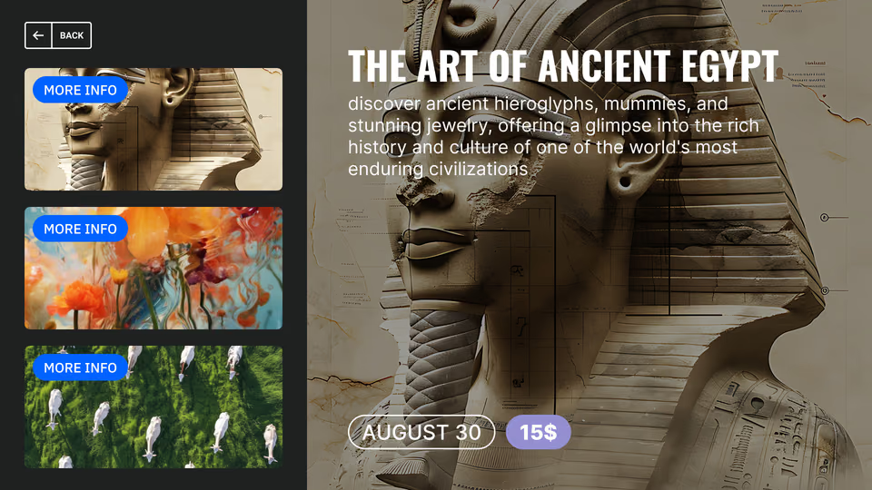
A digital label carries what a printed card cannot: the object text, several images, archive video of the object in use, and the curator's longer note for the visitor who reads everything.
Correcting an attribution or a date is an edit in the browser rather than a print run, and images and video keep playing from the player's cache if the gallery loses its connection.
Best for: Object labels, attributions and credits, archive video, curator notes, conservation notices
Interactive kiosks and touch points
The visitor decides how deep to go.
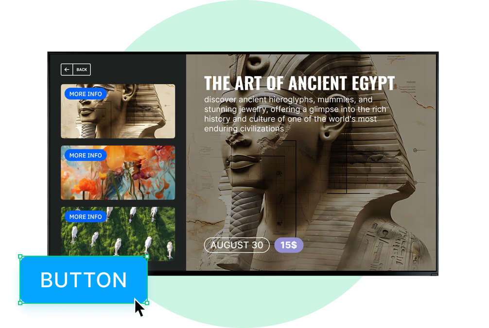
There are layers that never fit on a wall, and a kiosk is where they live: high-resolution views of the object, a timeline, the parts of the building visitors never see, the rest of the collection sitting behind the case.
The tap-through is built from button widgets and scenes, and an idle timeout sends the screen back to its welcome loop for whoever comes next.
Best for: Object deep dives, timelines, collection browsing, language choice, QR to the mobile guide
Wayfinding points and stairwells
Send visitors the right way when a gallery closes.
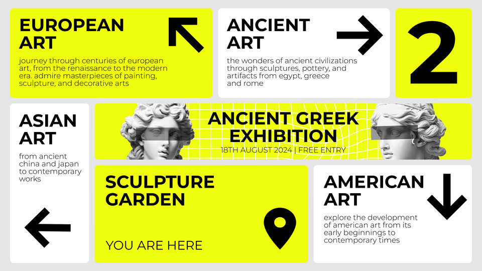
Screens at the junctions carry the floor plan, a you-are-here marker, the gallery directory and a suggested route for an hour, for two hours or for a whole day.
Your directions are content in the CMS; nothing is being worked out by a mapping engine. Rehang a gallery and the team redraws the route and sends it to all the wayfinding screens at once.
Best for: Floor plans, gallery directory, suggested routes, closures and diversions, restrooms and elevators
Atrium walls and immersive rooms
The screen that sets the tone for the visit.
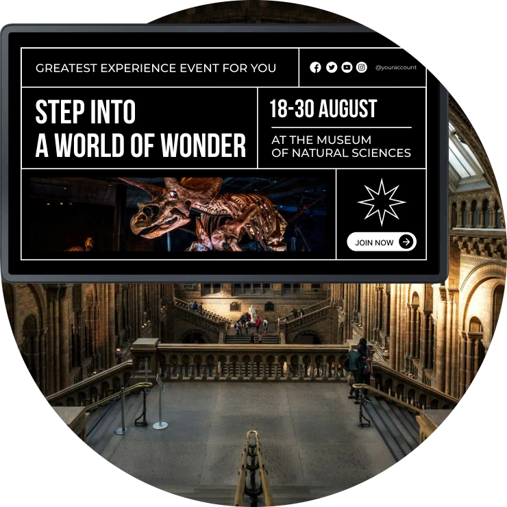
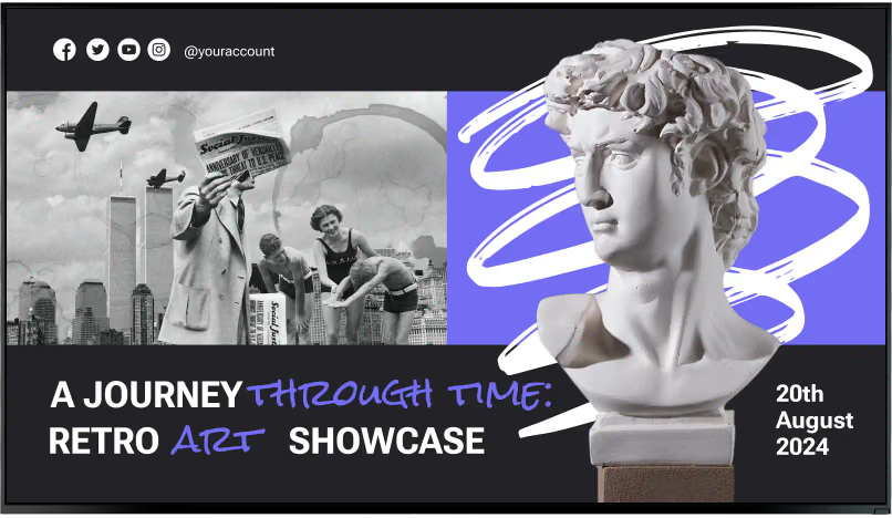
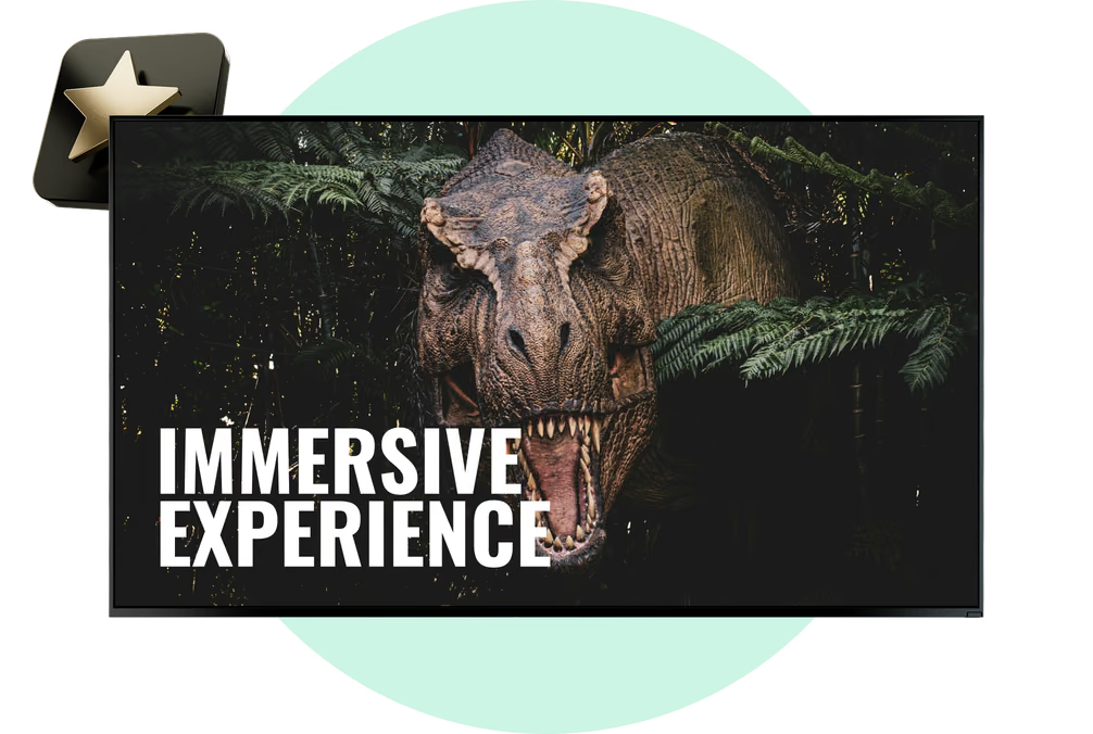
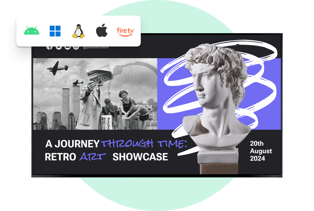
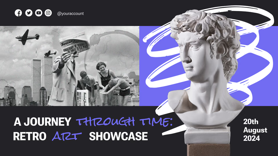
A large-format display or an LED wall in the atrium introduces the season, the temporary exhibition and the donors and sponsors behind it, on a schedule that changes with the program.
Whatever processor the wall already runs on stays where it is, with Look feeding it as one more source. An immersive room therefore sits in the same account as the small label beside the object downstairs.
Best for: Season openers, exhibition trailers, donor and sponsor recognition, immersive backdrops, atmosphere loops
Museum shop and café
Catch the visit on the way out.
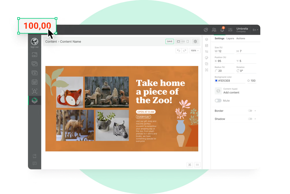
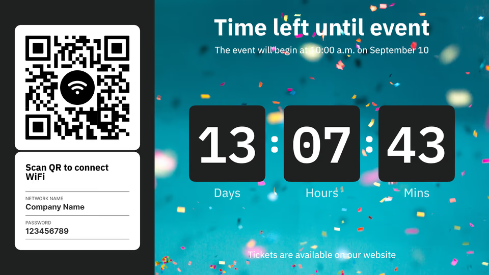
Screens on the exit path carry the exhibition catalog and the merchandise tied to the show, café hours and the day's offer, and the membership or donation page as a QR code.
Prices and offers live in the CMS, so the shop board turns over with the exhibition rather than the print order.
Best for: Exhibition merchandise, café menu and hours, membership and donation QR, last entry notices, events on sale