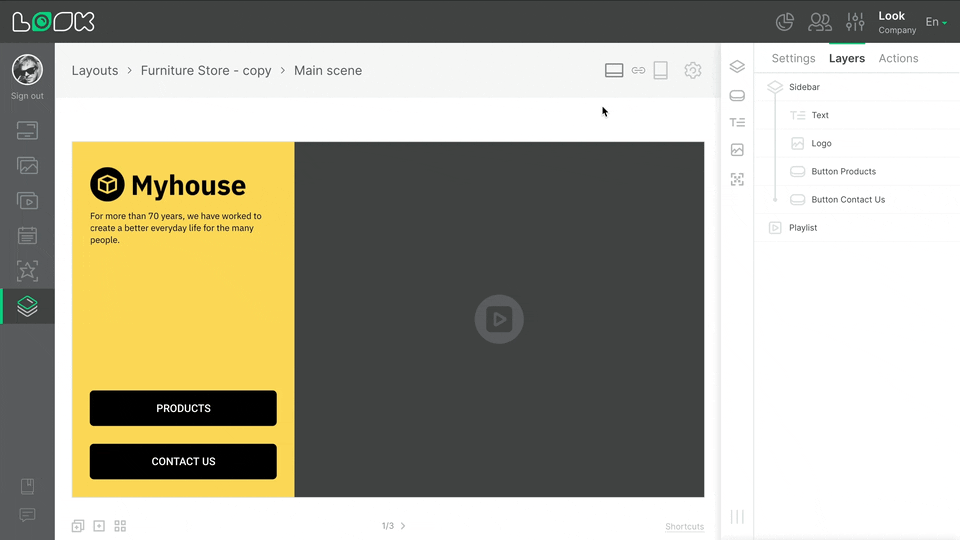
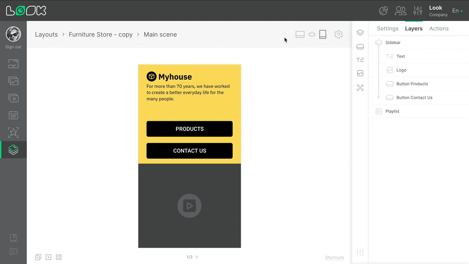
Adaptive orientation
Because all layout size and positioning settings are specified in percentages, layouts adjust to fit any screen resolution while maintaining their proportions and position. However, sometimes it is necessary to adjust the layout for different screen resolutions. For example, if you have multiple screens in a group of screens with different orientations: vertical and horizontal.
Layout Orientation
- To see how the layout will look in horizontal and vertical orientation, use the icons to the left of the settings icon in the page navigation panel.
- All layout changes are automatically applied to both orientations. To separately adjust the horizontal and vertical layout orientations, click on the chain icon Unlink layout orientations. When you unlink the orientations, the vertical and horizontal versions of the layout adjust independently. This means that you can change the aspect ratio, positioning, add or remove layers and widgets in one orientation of the layout, and it will not affect appearance of the layout in the other orientation.
- To restore the link between the horizontal and vertical orientations of the layout, click the Link layout orientation chain icon. The link is reestablished, and the modal window prompts you to choose which orientation settings to save; the settings for the opposite orientation are automatically deleted.
Can't find your answer?
Contact Support


