Screen Layout Button
The Button widget allows you to open any content item or move to other scenes with the click of a button. This widget can be used to create multi-level interactive scenarios.
To add the Button widget, click on the Button icon in the toolbar, or use the [B] hotkey.
Target Content
Target Content is the content or scene that should be opened when the button is clicked. The target content is required for the widget to function properly.
To add target content, click on the Add content button and select a required content item or scene.
Idle Timeout
The Idle Timeout is a period of time after which a content element or a scene to which we clicked the button should close, returning the layout to its original state. To change the Idle Timeout, enter a desired value in the field of the same name (time is specified as hh:mm:ss).
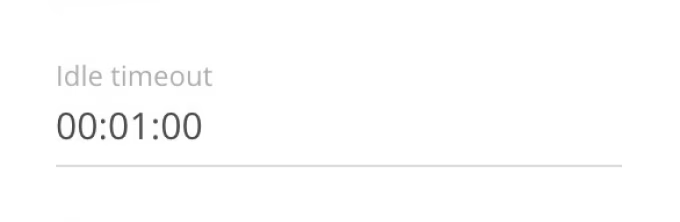
For example, if clicking the button opens a Web content, the time specified in Idle Timeout starts counting from the moment the user last touched the touchscreen.
Basic Settings
The main settings are responsible for the appearance of the button.
- Whole layer. If you activate the Whole layer switch, the button will become invisible, and the area you click on it will extend to the whole layer to which the button belongs.

- Load my image. Allows to use your own graphics (jpg, png) as a button.
- To set your own image for the button, activate the Load my image slider and click Upload your image.
- In the additional panel that opens, the required image or upload a new one using the Upload button.
The image will be resized while maintaining proportions. If you don't want to keep the original aspect ratio, click on the lock icon (keep original ratio) located between the width and height input fields.
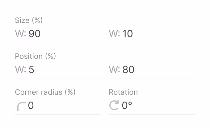
- Next come the settings for size, positioning, corner radius, and button rotation around its own axis.
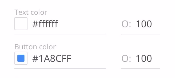
- Color. A group of settings that allows setting a custom color for the button text and background. The O (Opacity) parameter is responsible for transparency.
- Button text & Text size. The button text can be changed both in the settings panel and in the workspace by double-clicking on the text field. The text size is configured in percentage. Clicking the icon to the right of the text size box will automatically increase the text to the maximum possible size.
Target Content Opening Area
By default, the target content opens in full screen. However, the opening area can be changed so that the content opens in a specific layer instead of full screen.
- To open content in a specific layer, click on the Open in and select a required scene from the drop-down list.
- Specify the layer where the content item should open.
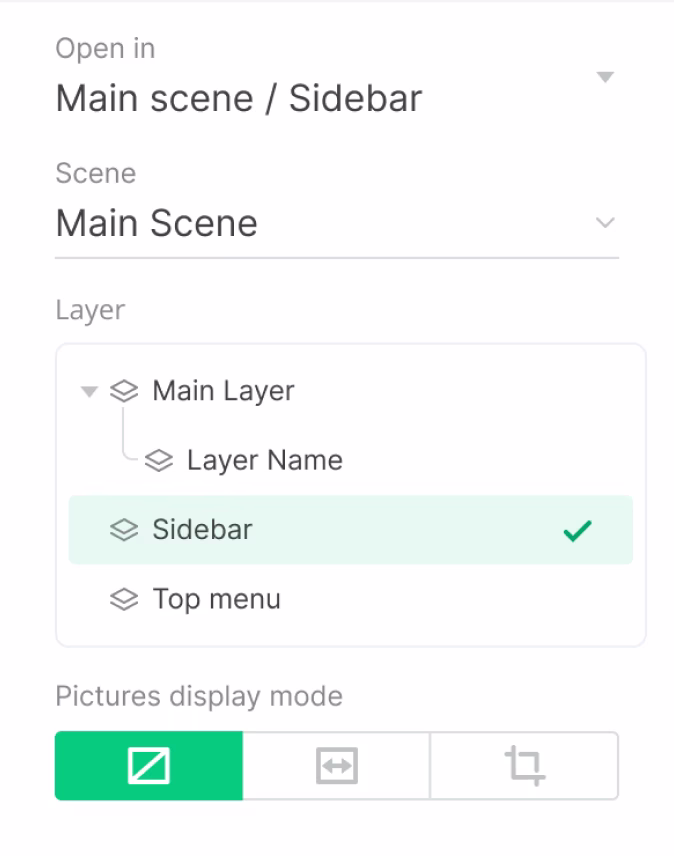
If you select a layer not in the current scene, but in a different scene, the scene will be changed in addition to opening the target content.
If the layer where the target content is to be opened is deleted, the button becomes invalid and disappears from the screen. To fix this, you need to re-specify the content opening area for this button.
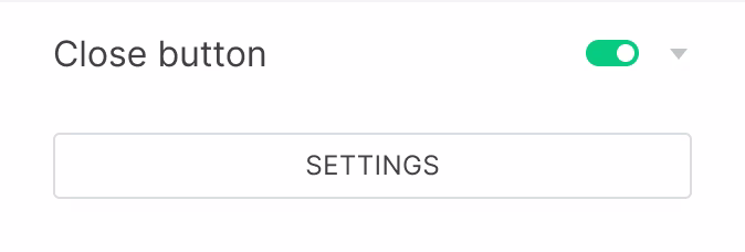
Close Button
Close button allows the user to close the target content without waiting for the Idle Timeout period to expire.
- To configure the Close Button, activate the slider. When you turn it on for the first time, you will immediately be taken to the close button settings window, otherwise press the Settings button directly below the Close button slider.
- The Close button is customizable in respect of the content item or scene that is opened by the parent Button widget.
- In the edit mode of the Close button, you cannot select or edit any objects other than this button.
To return to the edit mode of the previous scene, click the Back to scene button below the workspace or in the settings panel.
- For the Close button, just like for a regular button, you can configure customizable graphics. To do this, turn on the Load my image slider and select a desired image in the additional panel that opens, or upload a new image using the Upload button.

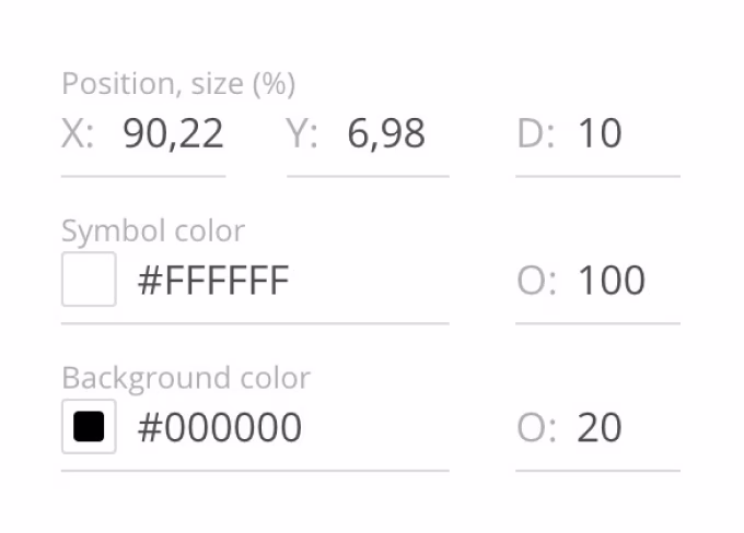
- The following settings are available for the standard Close Button:
- Position, Size - positioning on the screen along the axes X and Y, and diameter D.
- Symbol & Background Color - color of the background and symbol, as well as the ability to adjust opacity O.
- When the Close Button is configured, you can save it as a template to quickly apply the required settings to any other close button later.
- To do this, click on the Template drop-down list at the very top of the settings panel and select Create template.
- Enter a name for the new template and click the Add button.
- To apply a previously saved template, open the Template drop-down list and select a required template from your list.


