Botão de layout de tela
O Botão widget permite que você abra qualquer item de conteúdo ou mude para outro cenas com o clique de um botão. Esse widget pode ser usado para criar cenários interativos em vários níveis.
Para adicionar o Botão widget, clique no Botão ícone na barra de ferramentas ou use o [B] tecla de atalho.
Conteúdo alvo
Conteúdo de destino é o conteúdo ou a cena que deve ser aberta quando o botão é clicado. O conteúdo de destino é necessário para que o widget funcione corretamente.
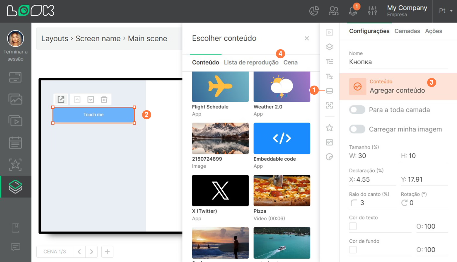
Para adicionar conteúdo de destino, clique no Agregar conteúdo botão e selecione um item de conteúdo ou cena necessário.
Tempo limite de inatividade
O Tempo limite de inatividade é um período após o qual um elemento de conteúdo ou uma cena na qual clicamos no botão deve fechar, retornando o layout ao seu estado original. Para alterar o Tempo limite de inatividade, insira o valor desejado no campo com o mesmo nome (a hora é especificada como hh:mm:ss).
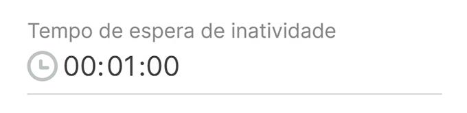
Por exemplo, se clicar no botão abrir um Conteúdo da web, o tempo especificado em Idle Timeout começa a ser contado a partir do momento em que o usuário tocou pela última vez na tela sensível ao toque.
Configurações básicas
As configurações principais são responsáveis pela aparência do botão.
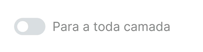
- Para a toda camada. Se você ativar o Para a toda camada Se você mudar, o botão ficará invisível e a área em que você clicar nele se estenderá por toda a camada à qual o botão pertence.
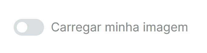
- Carregar minha imagem. Permite usar seus próprios gráficos (jpg, png) como um botão.
- Para definir sua própria imagem para o botão, ative o Carregar minha imagem controle deslizante e clique Carregar conteúdo.
- No painel adicional que se abre, a imagem necessária ou faça o upload de uma nova usando o Carregar botão.
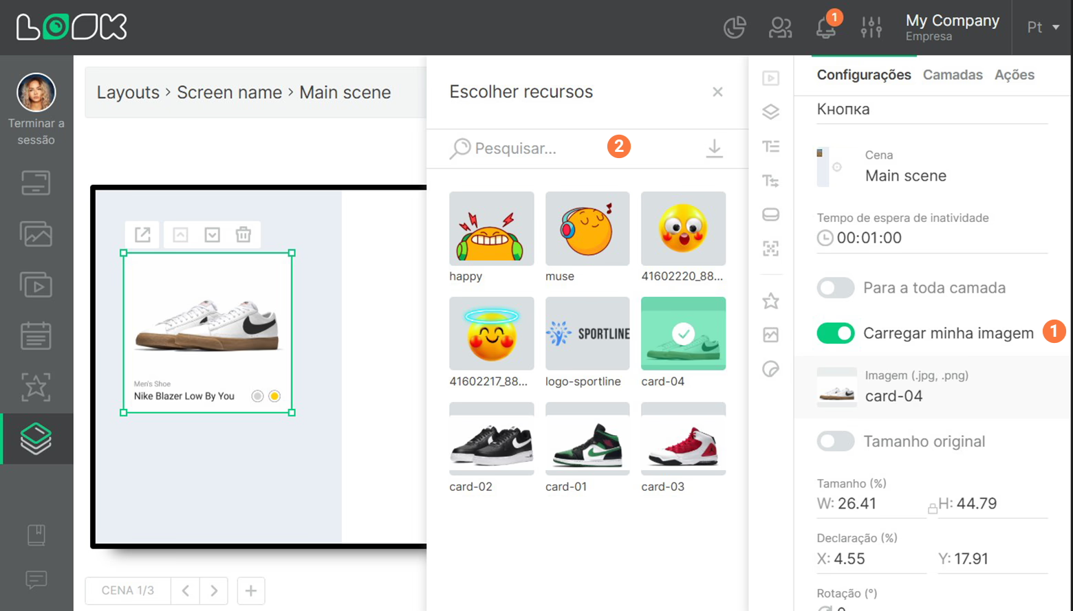
A imagem será redimensionada mantendo as proporções. Se você não quiser manter a proporção original, clique no ícone de cadeado (manter a proporção original) localizado entre os campos de entrada de largura e altura.
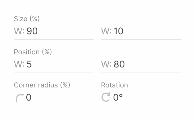
- Em seguida, vêm as configurações de tamanho, posicionamento, raio do canto e rotação do botão em torno de seu próprio eixo.
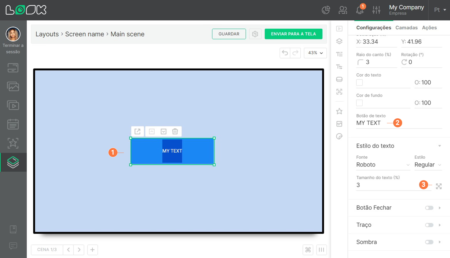
- Cor. Um grupo de configurações que permite definir uma cor personalizada para o texto e o plano de fundo do botão. O O O parâmetro (Opacidade) é responsável pela transparência.
- Botão texto e tamanho do texto. O texto do botão pode ser alterado no painel de configurações e na área de trabalho clicando duas vezes no campo de texto. O tamanho do texto é configurado em porcentagem. Clicar no ícone à direita da caixa de tamanho do texto aumentará automaticamente o texto até o tamanho máximo possível.
Área de abertura do conteúdo alvo
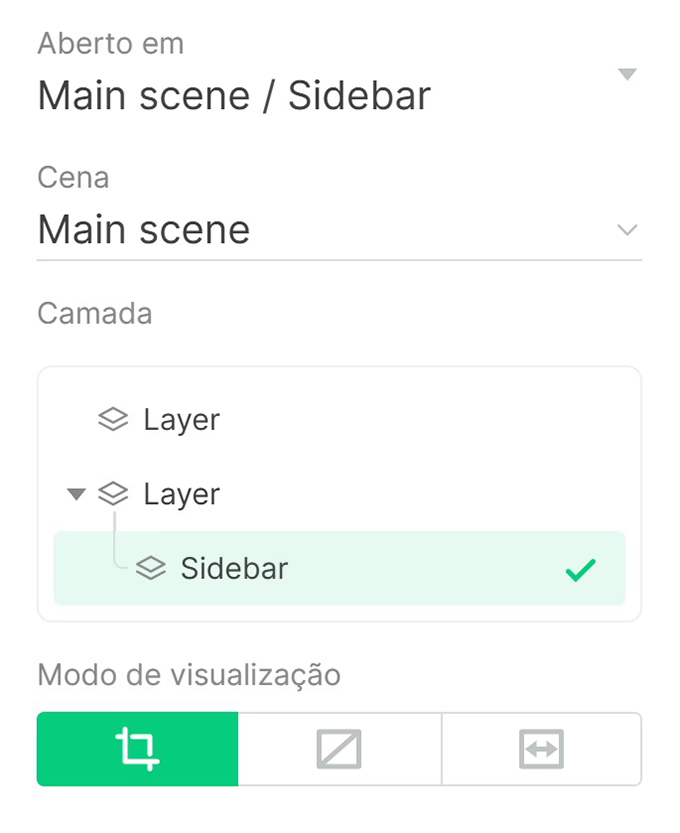
Por padrão, o conteúdo de destino é aberto em tela cheia. No entanto, a área de abertura pode ser alterada para que o conteúdo seja aberto em uma camada específica em vez de em tela cheia.
- Para abrir o conteúdo em uma camada específica, clique no Abrir em e selecione uma cena necessária na lista suspensa.
- Especifique a camada em que o item de conteúdo deve ser aberto.
Se você selecionar uma camada que não está na atual cena, mas em uma cena diferente, a cena será alterada além de abrir o conteúdo de destino.
Se a camada em que o conteúdo de destino deve ser aberto for excluída, o botão se tornará inválido e desaparecerá da tela. Para corrigir isso, você precisa especificar novamente a área de abertura de conteúdo para esse botão.
Botão Fechar
Botão Fechar permite que o usuário feche o conteúdo de destino sem esperar pelo Tempo limite de inatividade período para expirar.
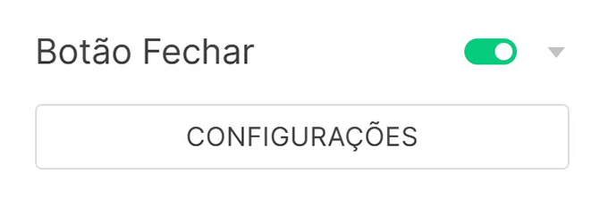
- Para configurar o Botão Fechar, ative o controle deslizante. Ao ligá-lo pela primeira vez, você será imediatamente direcionado para a janela de configurações do botão Fechar, caso contrário, pressione a tecla Preferências botão diretamente abaixo do Botão Fechar controle deslizante.
- O Botão Fechar é personalizável em relação ao item de conteúdo ou cena que é aberto pelo pai Botão widget.
- No modo de edição do Botão Fechar, você não pode selecionar nem editar nenhum objeto além desse botão.
Para retornar ao modo de edição da cena anterior, clique no botão Voltar à cena botão abaixo da área de trabalho ou no painel de configurações.
- Para o Botão Fechar, assim como em um botão normal, você pode configurar gráficos personalizáveis. Para fazer isso, ative o Carregar minha imagem controle deslizante e selecione a imagem desejada no painel adicional que se abre ou faça o upload de uma nova imagem usando o Carregar botão.
- As seguintes configurações estão disponíveis para o Botão Fechar padrão:
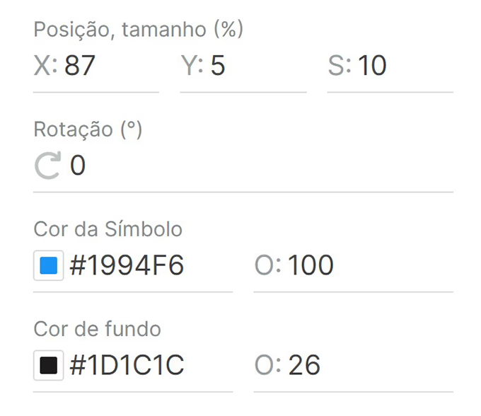
- Posição, tamanho - posicionamento na tela ao longo dos eixos X e Y, e diâmetro D.
- Símbolo e cor de fundo - cor do fundo e do símbolo, bem como a capacidade de ajustar a opacidade NÃO.
- Quando o Botão Fechar está configurado, você pode salvá-lo como um modelo para aplicar rapidamente as configurações necessárias a qualquer outro botão Fechar posteriormente.
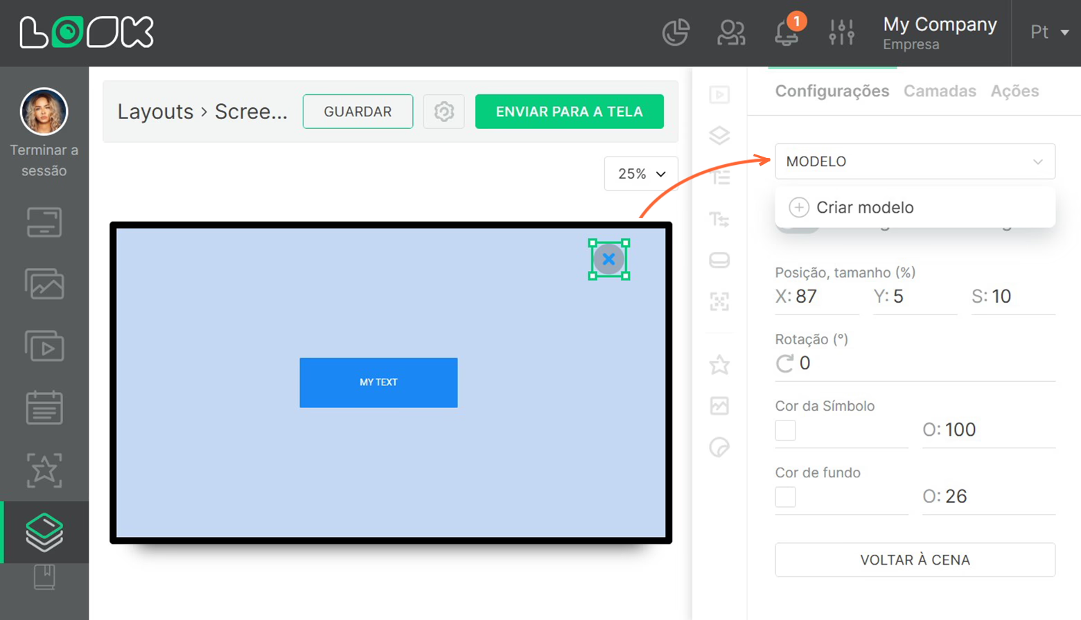
- Para fazer isso, clique no Modelo lista suspensa na parte superior do painel de configurações e selecione Criar modelo.
- Insira um nome para o novo modelo e clique no Agregar botão.
- Para aplicar um modelo salvo anteriormente, abra o Modelo lista suspensa e selecione um modelo necessário da sua lista.